深圳特区成立四十周年
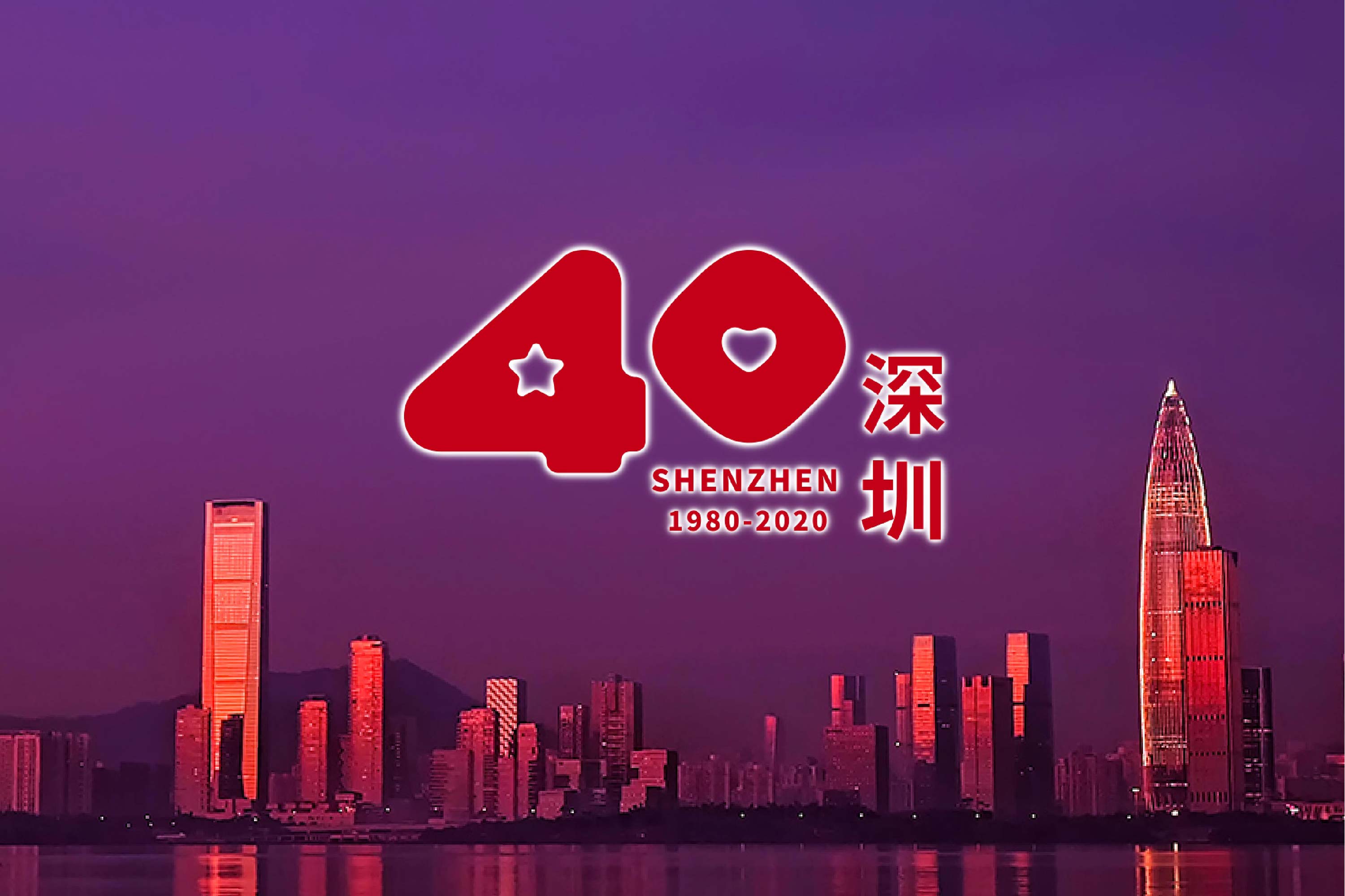
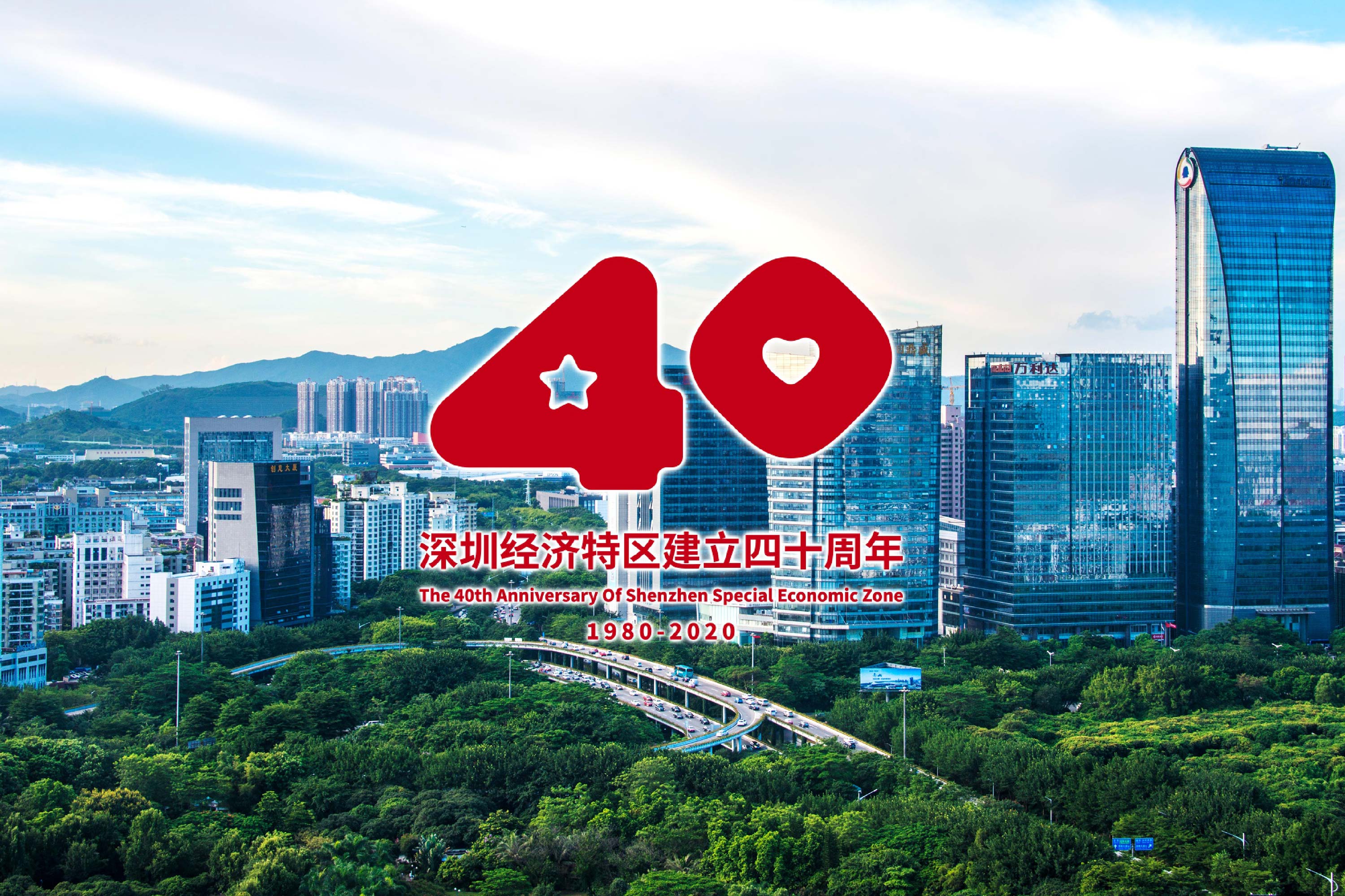
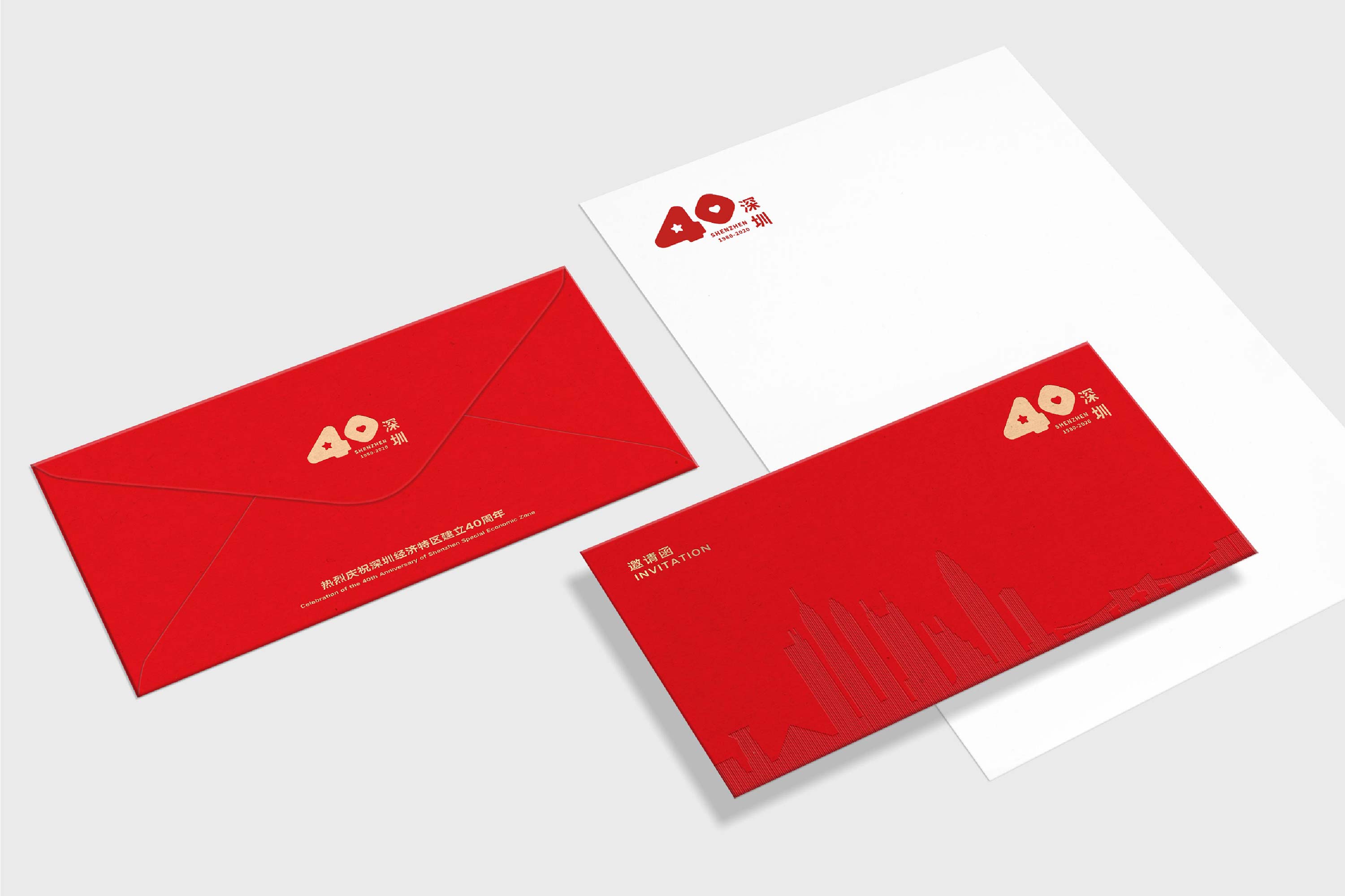
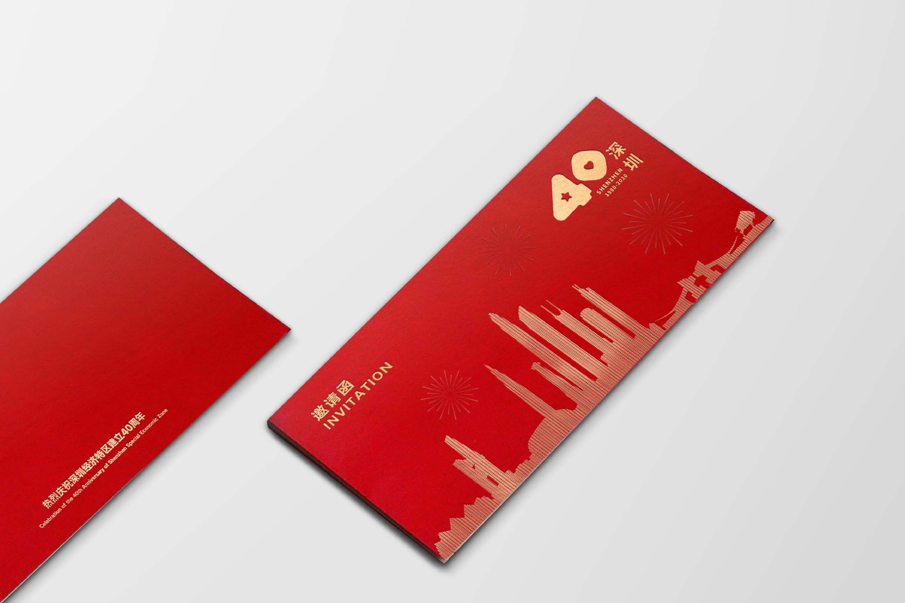
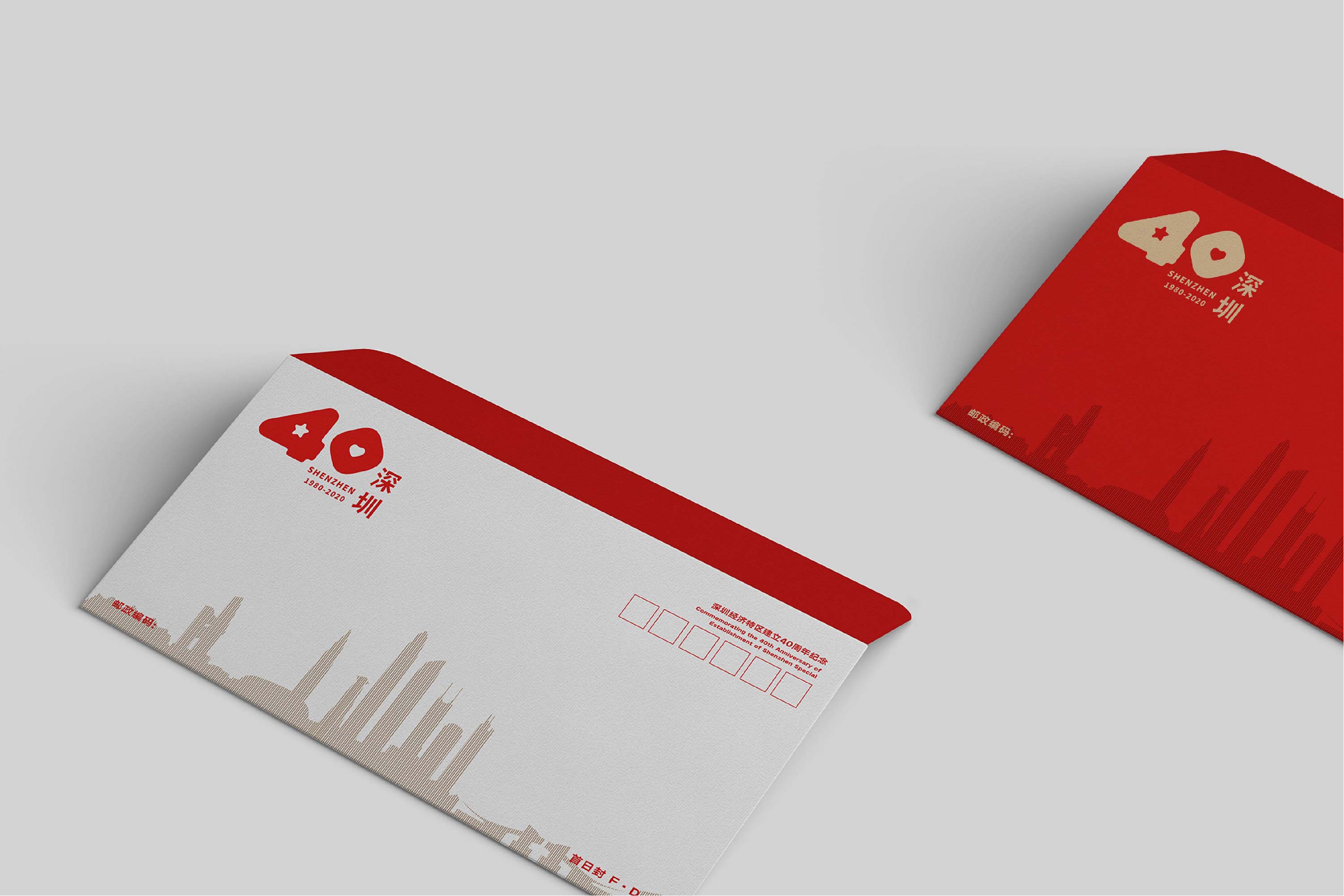
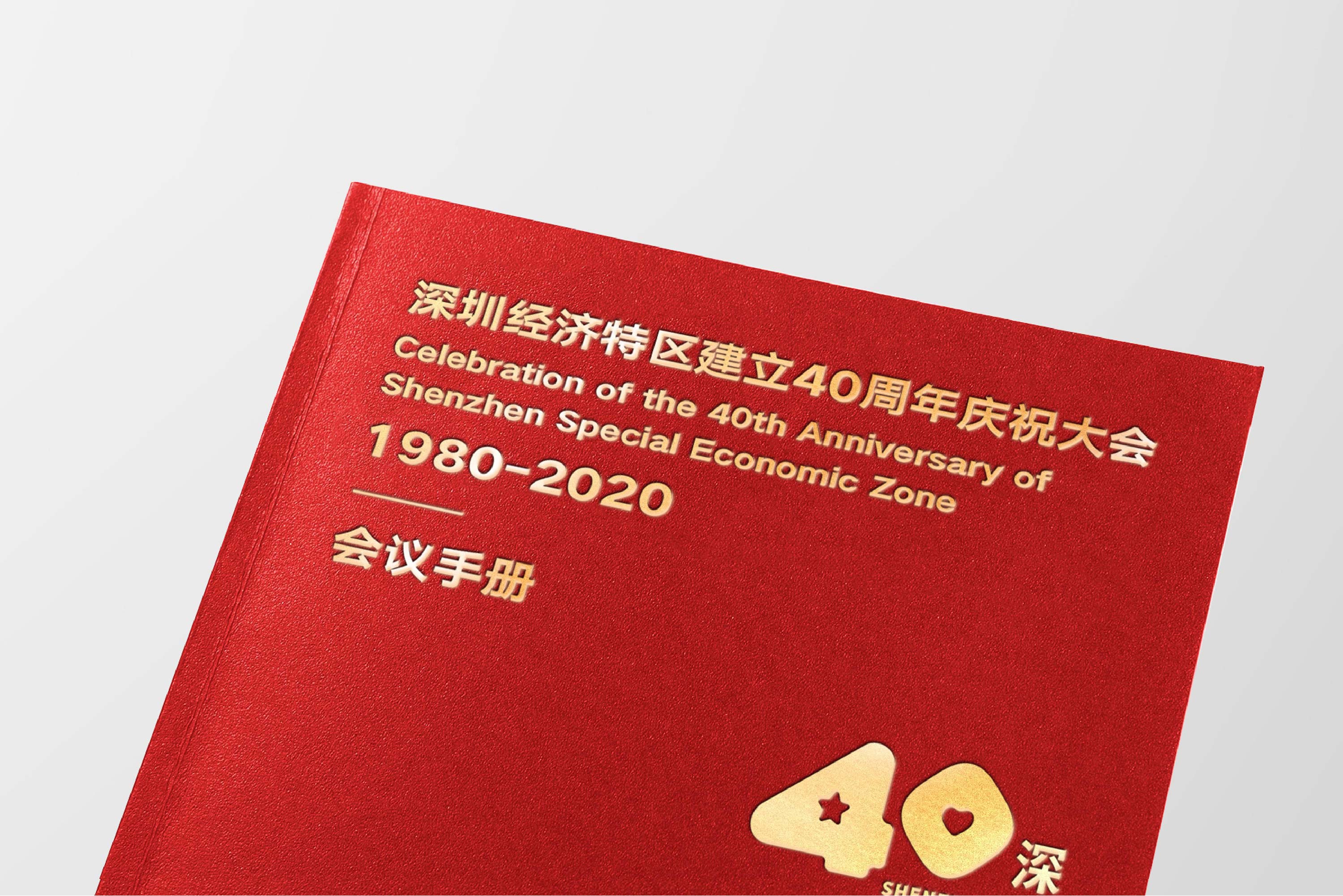
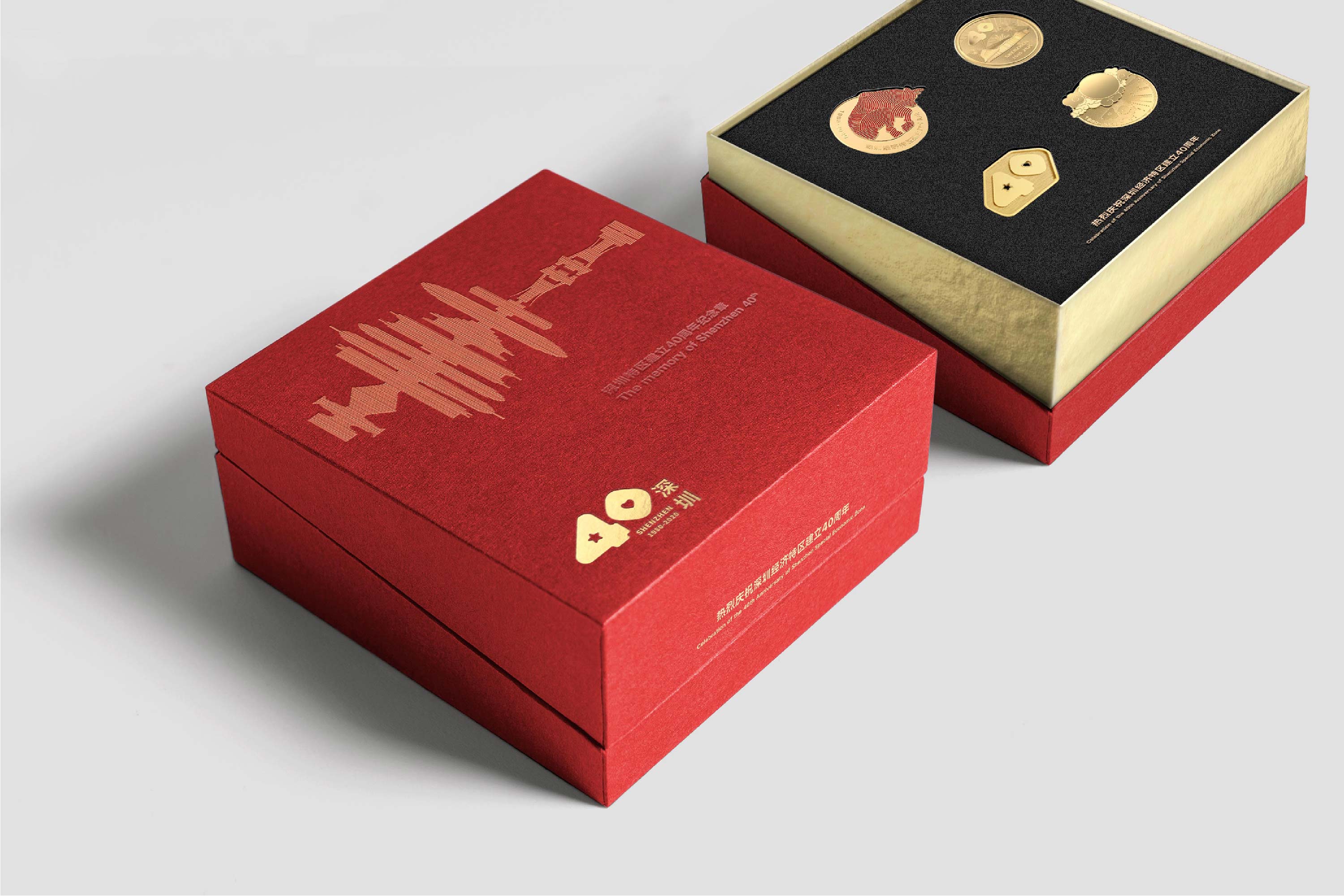
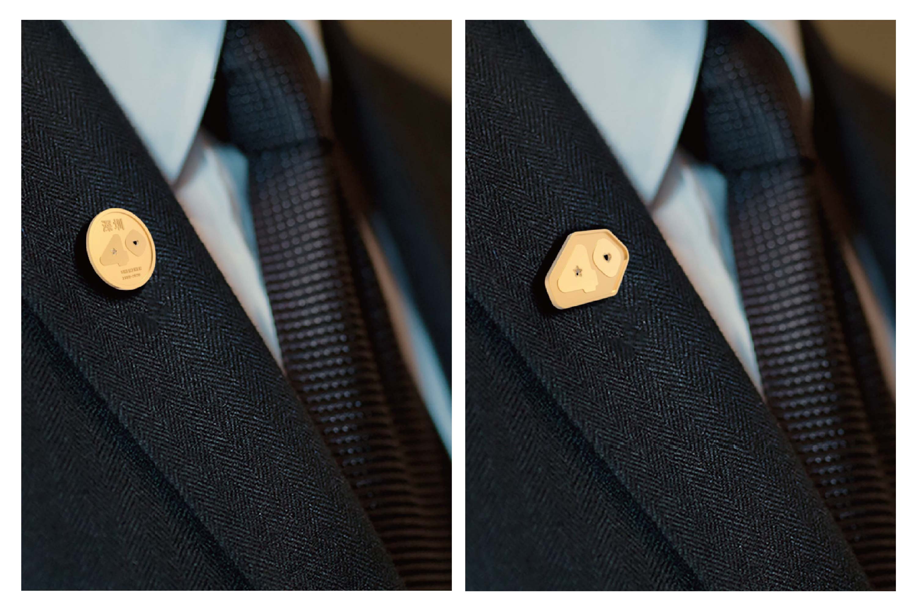
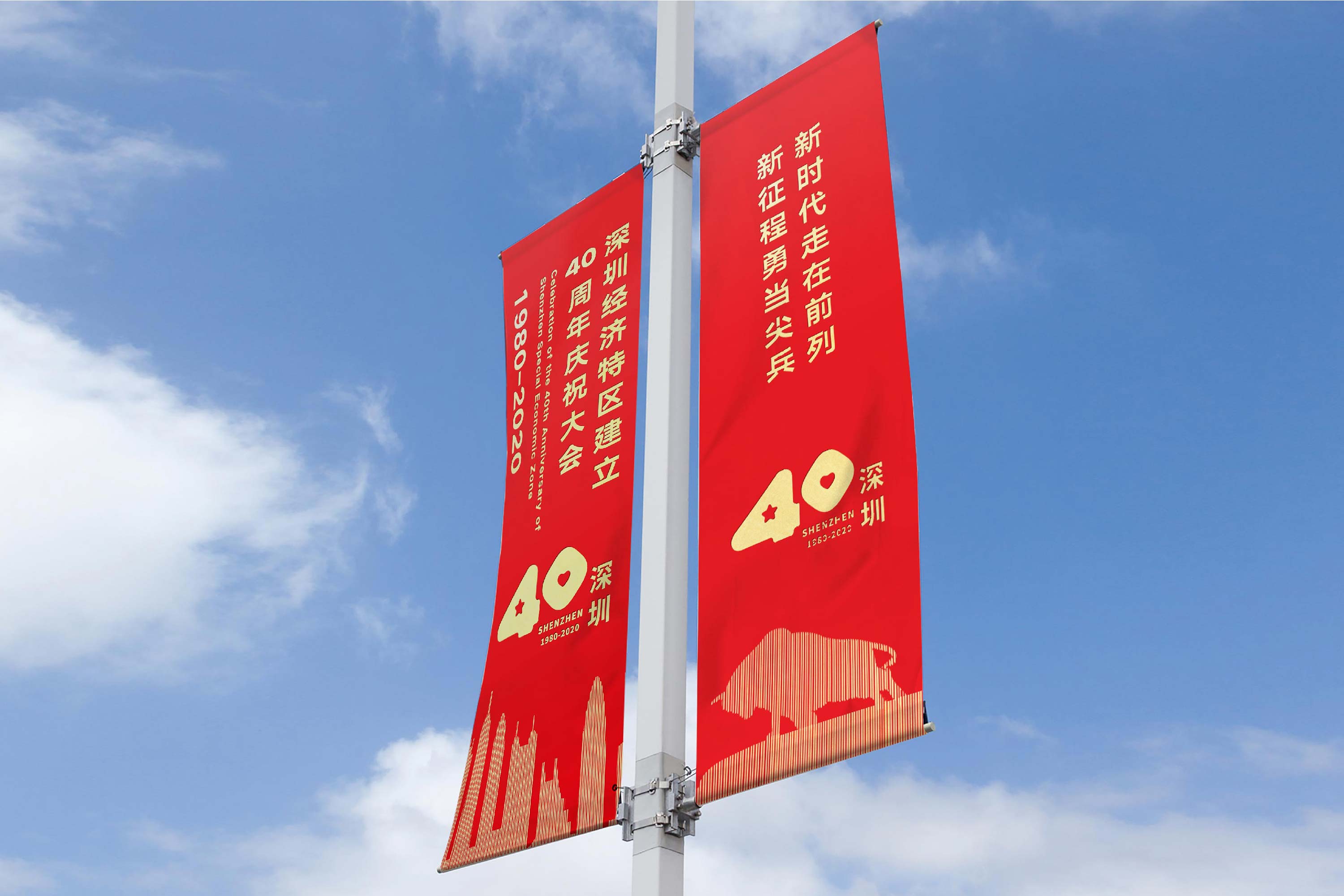
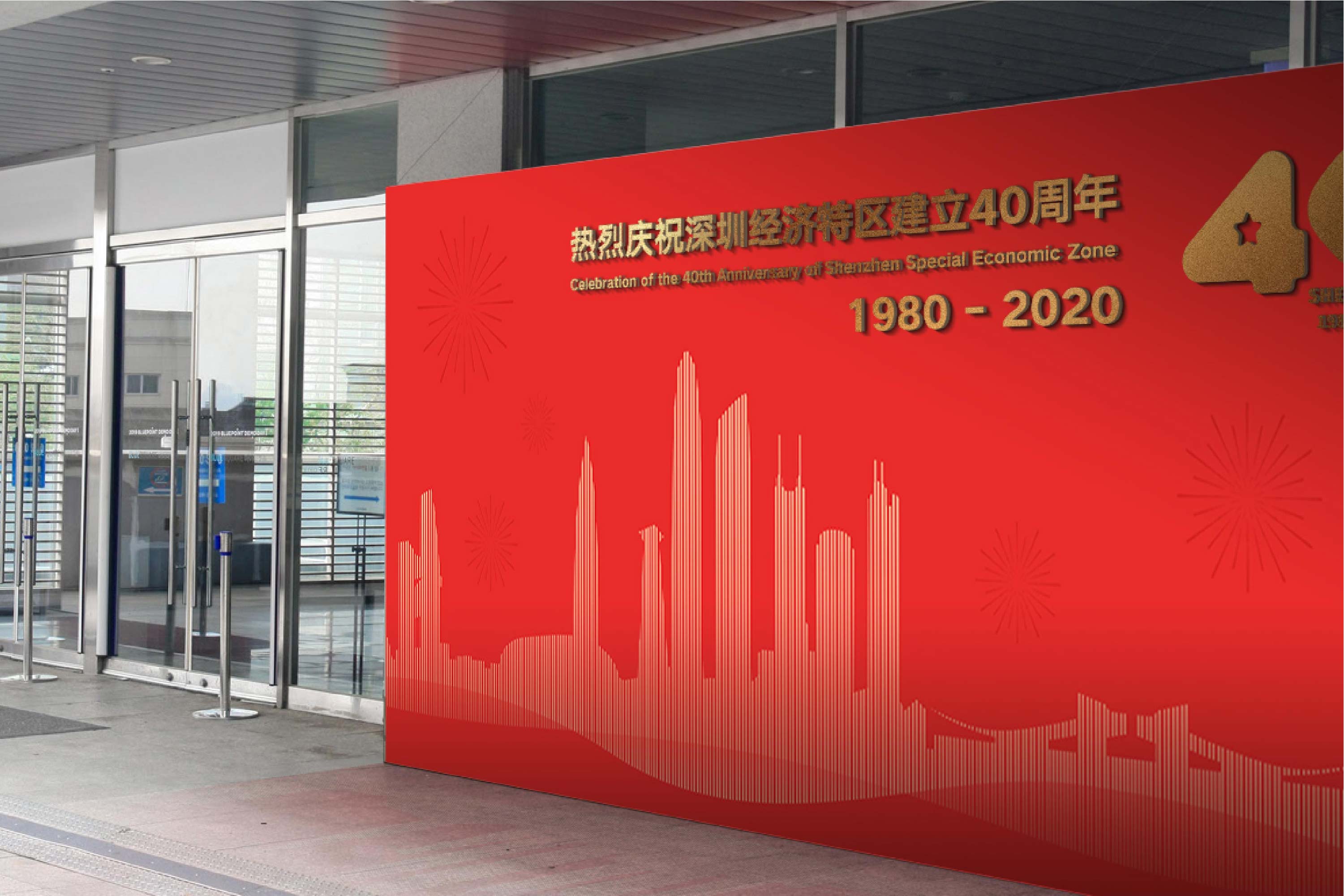
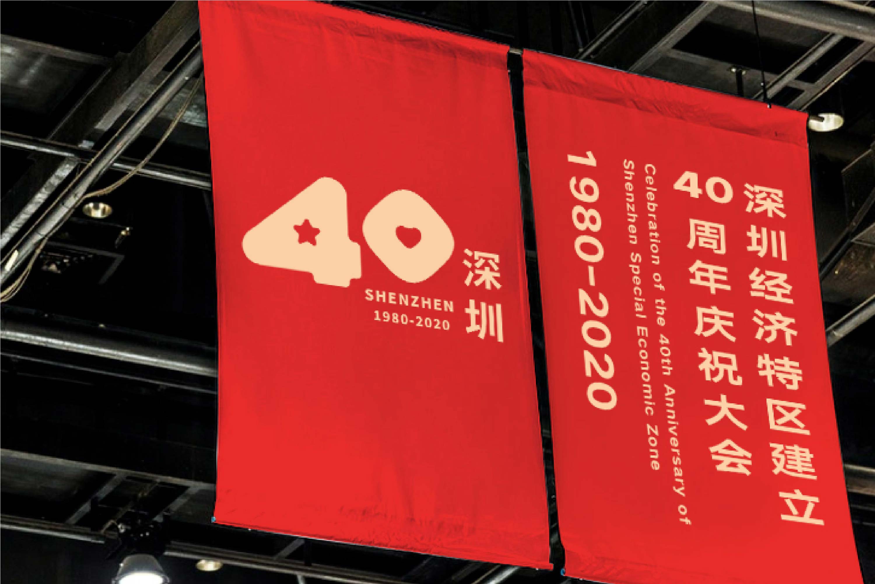
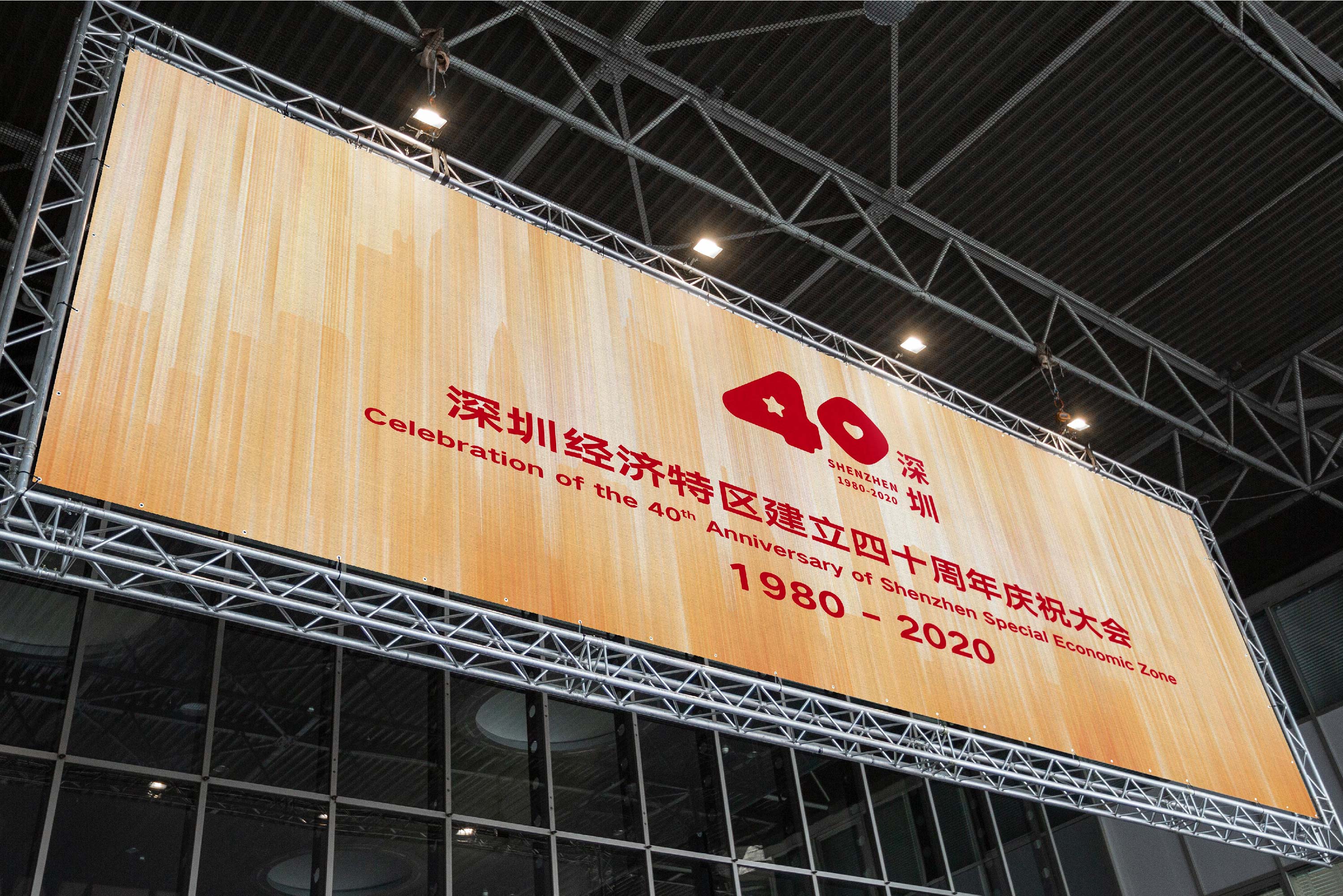
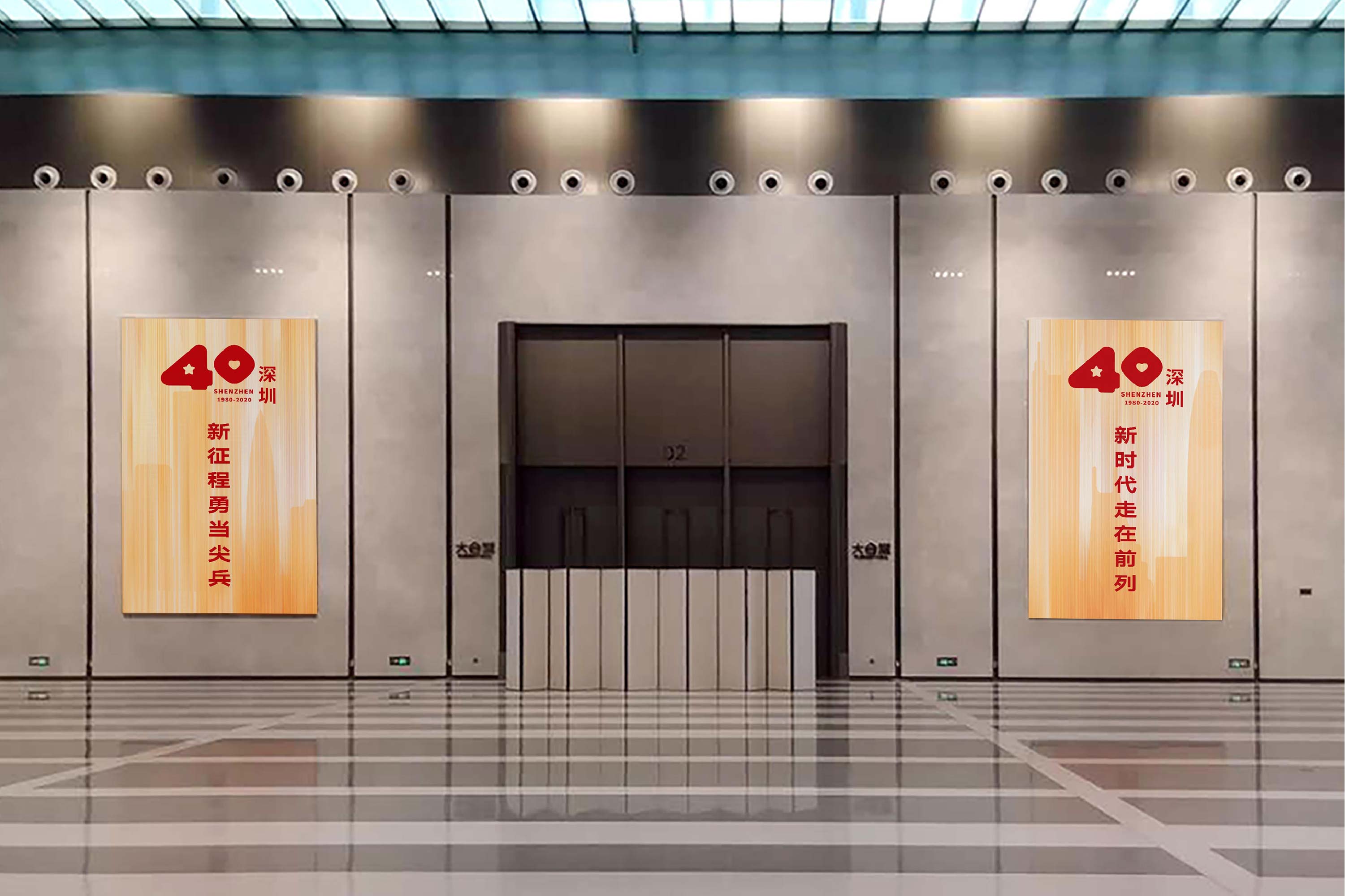
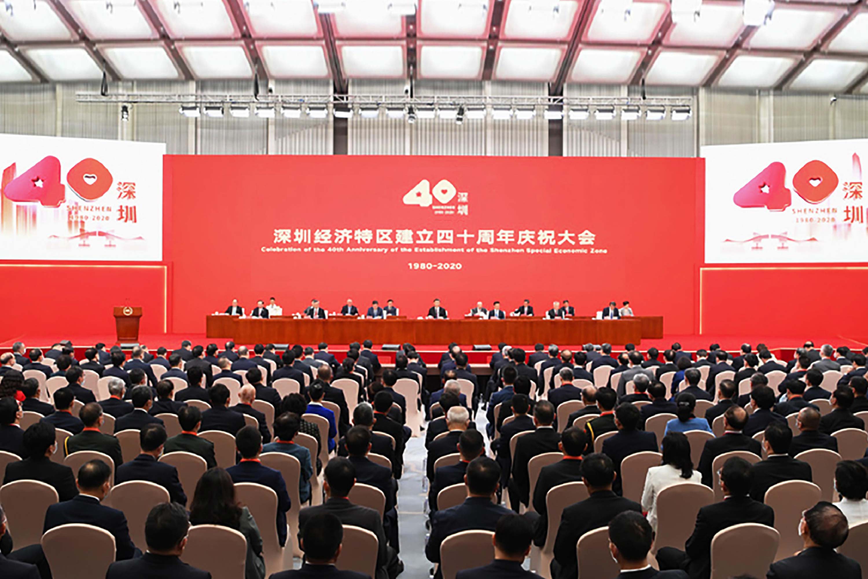
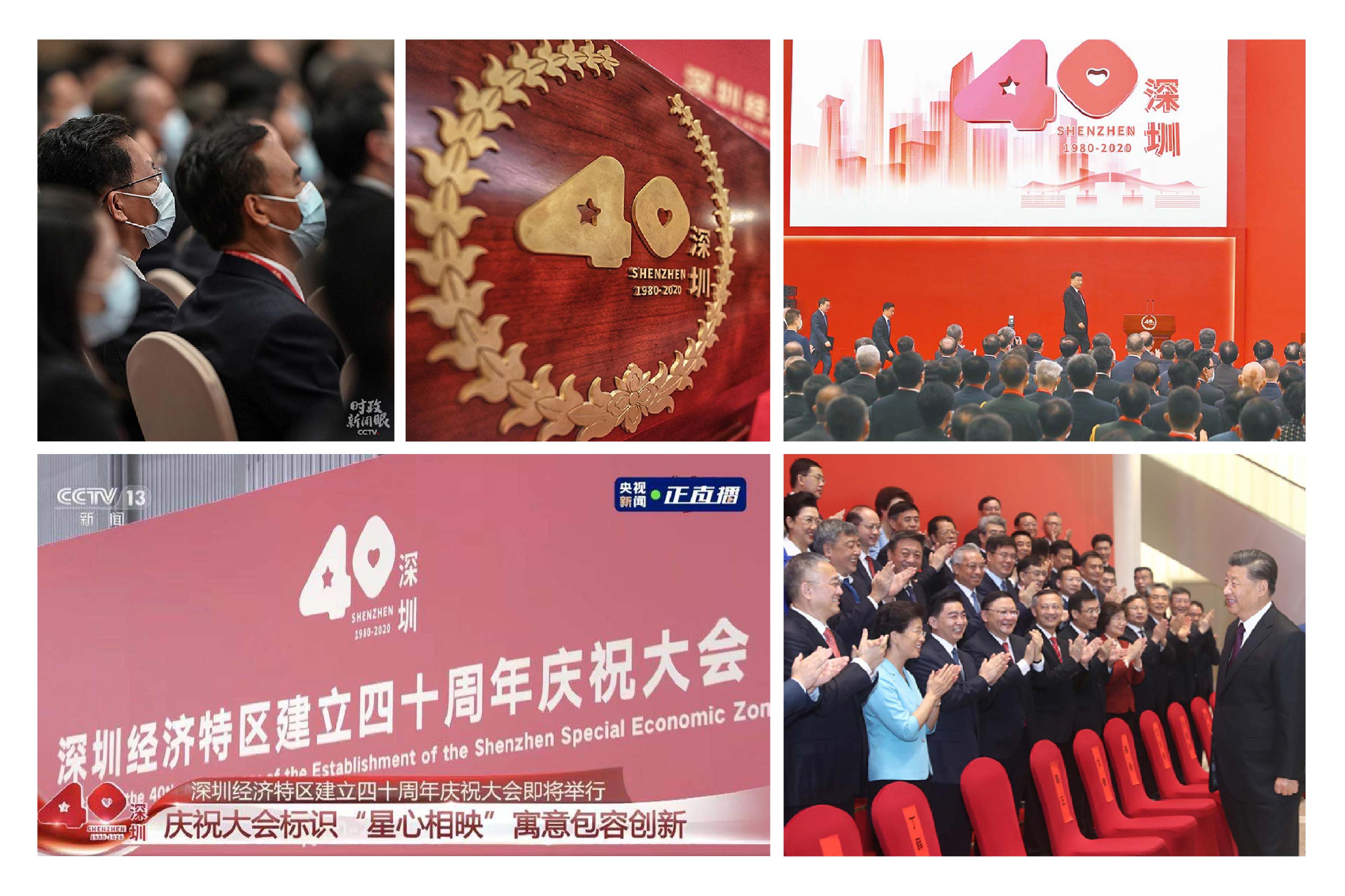
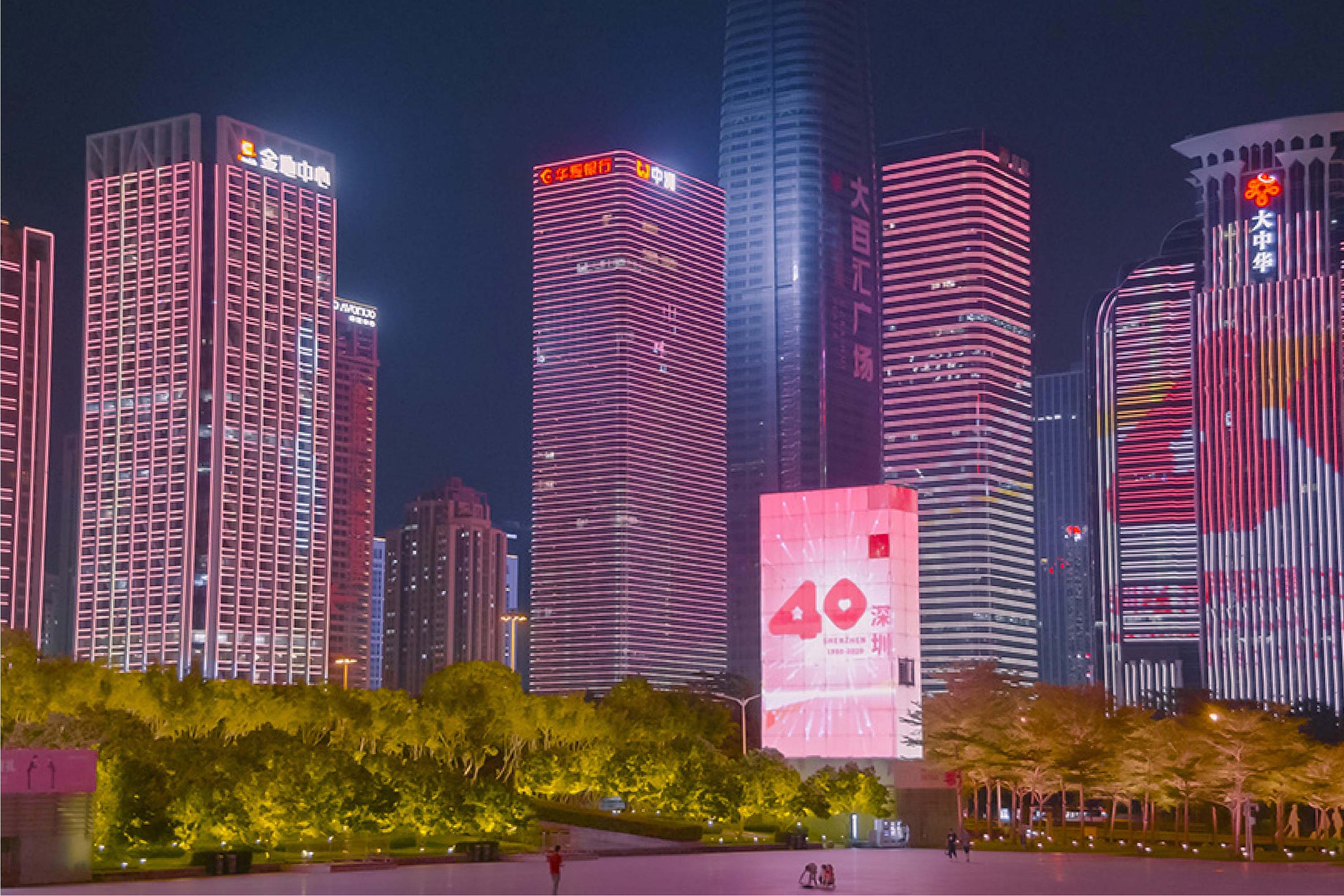
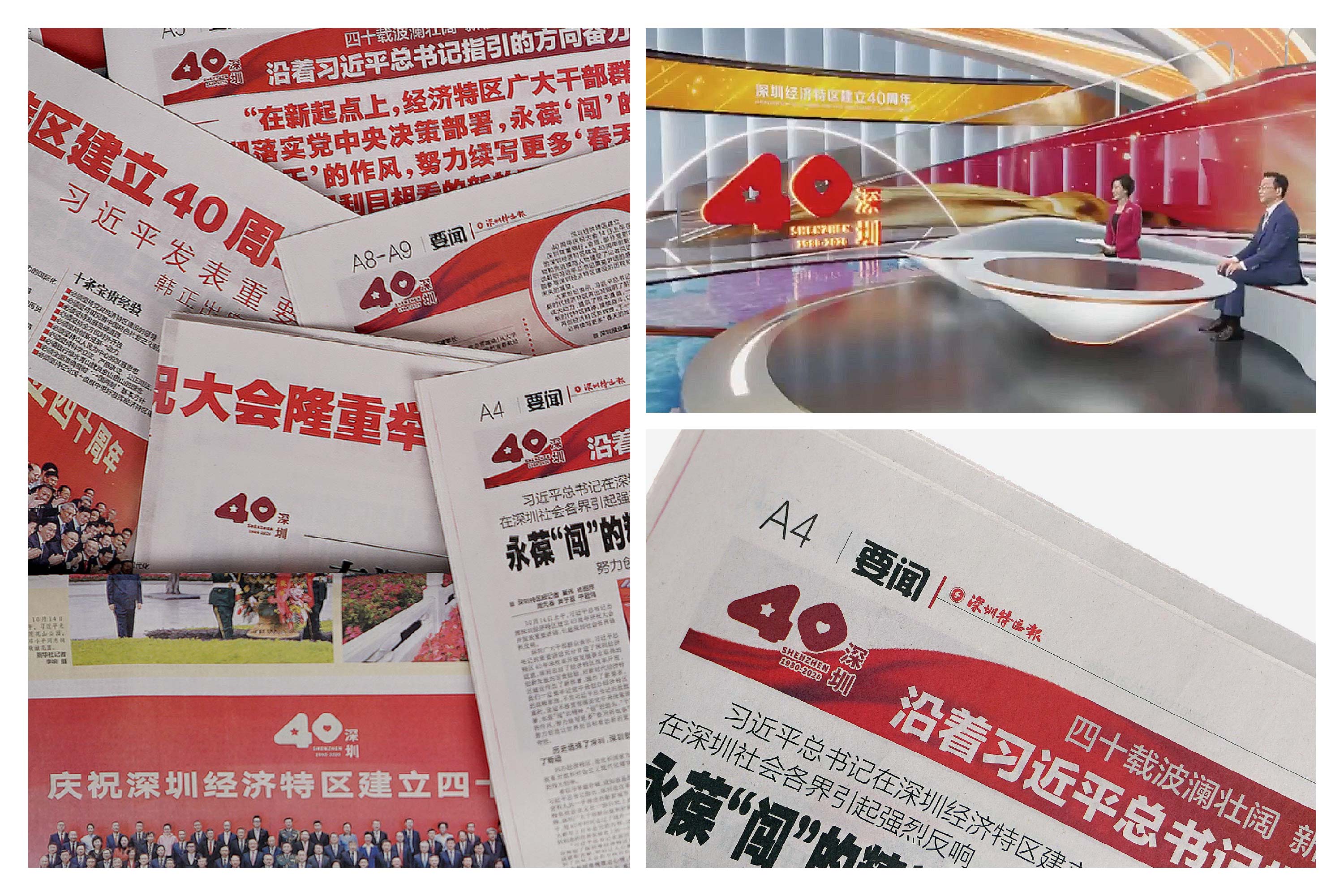
2020 marks the 40th anniversary of the establishment of Shenzhen Special Economic Zone. After 40 years of wonderful interpretation, Shenzhen has gone through the course of hundreds of years in some international metropolises abroad in 40 years. This is a miracle in the history of world development created by the Chinese people. The logo takes the number "40" and the red star from the national flag element and the heart shape representing "never forget the original heart, care about Shenzhen and care about the country" as the core elements, closely following the theme of the 40th anniversary of the establishment of Shenzhen Special Economic Zone. The rounded treatment of the glyph expresses the stable and friendly temperament and echoes the "inclusive and open" urban character of Shenzhen; The overall shape leaps upward to the right, which is the rhythm of "young vitality, innovative growth". With simple and clear font combination, it conveys a peaceful and open visual atmosphere, and also has strong universality.
-
2020年,深圳经济特区建立40周年,深圳经过四十年的精彩演绎,用40年时间走过了国外一些国际化大都市上百年走完的历程。这是中国人民创造的世界发展史上的一个奇迹。标识以数字 “40” 和取自国旗元素的红星、代表 “不忘初心、心系深圳、心系国家” 的心形作为核心元素,紧扣深圳经济特区建立40周年的主题。字形圆润的处理表达了稳健、亲和的气质,呼应深圳 “包容、开放” 的城市性格;整体外形向右上跃动,是 “年轻活力、创新成长” 的节奏感。配合简洁清晰的字形组合,传达平和开放的视觉氛围,同时也具有极强的普适性。
Art Director: Boyuan Song
Designer: Tiga
Year: 2021
Client: BRANDOR COFFEE
