健康阿鹿 Health Deer
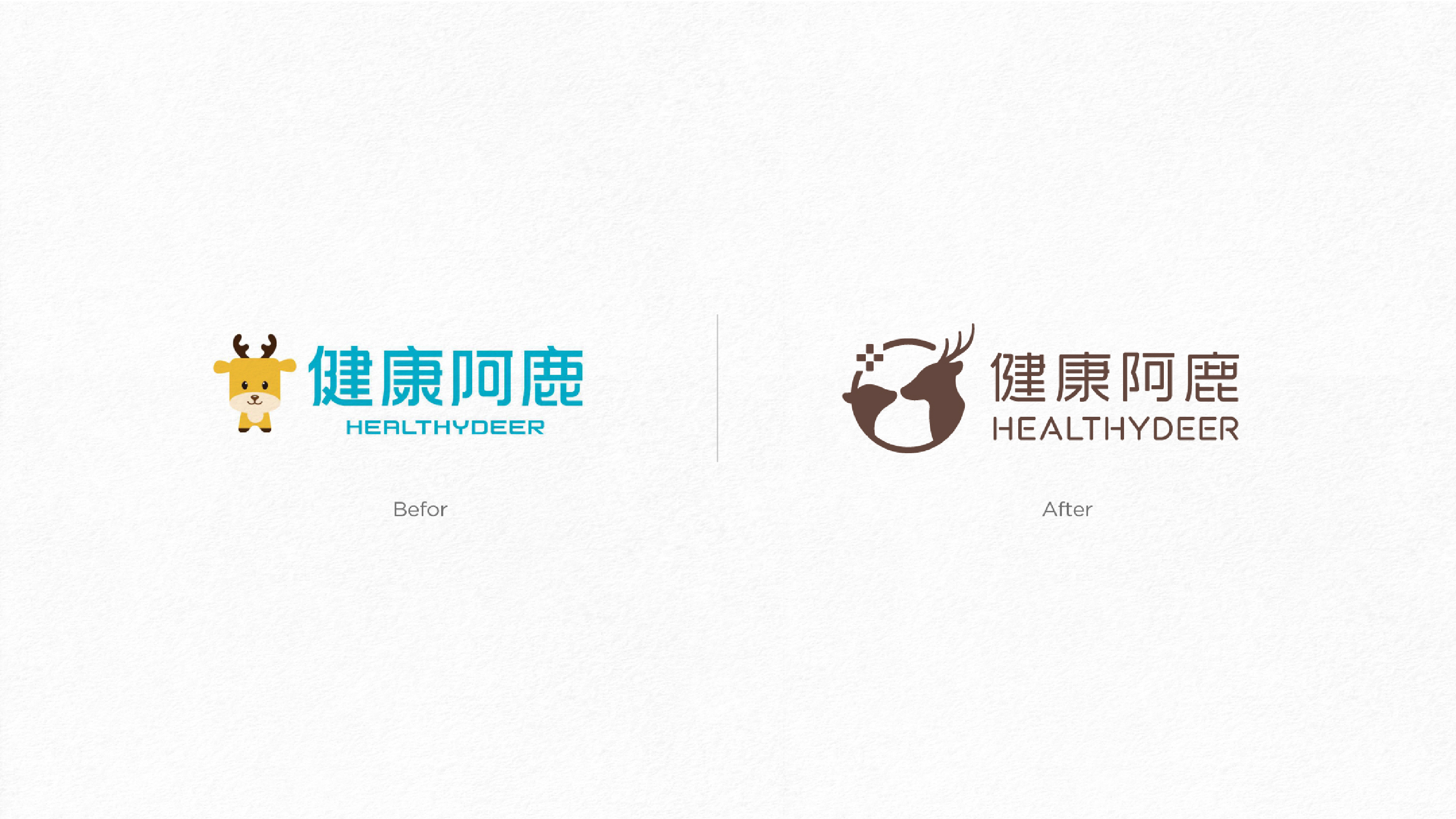
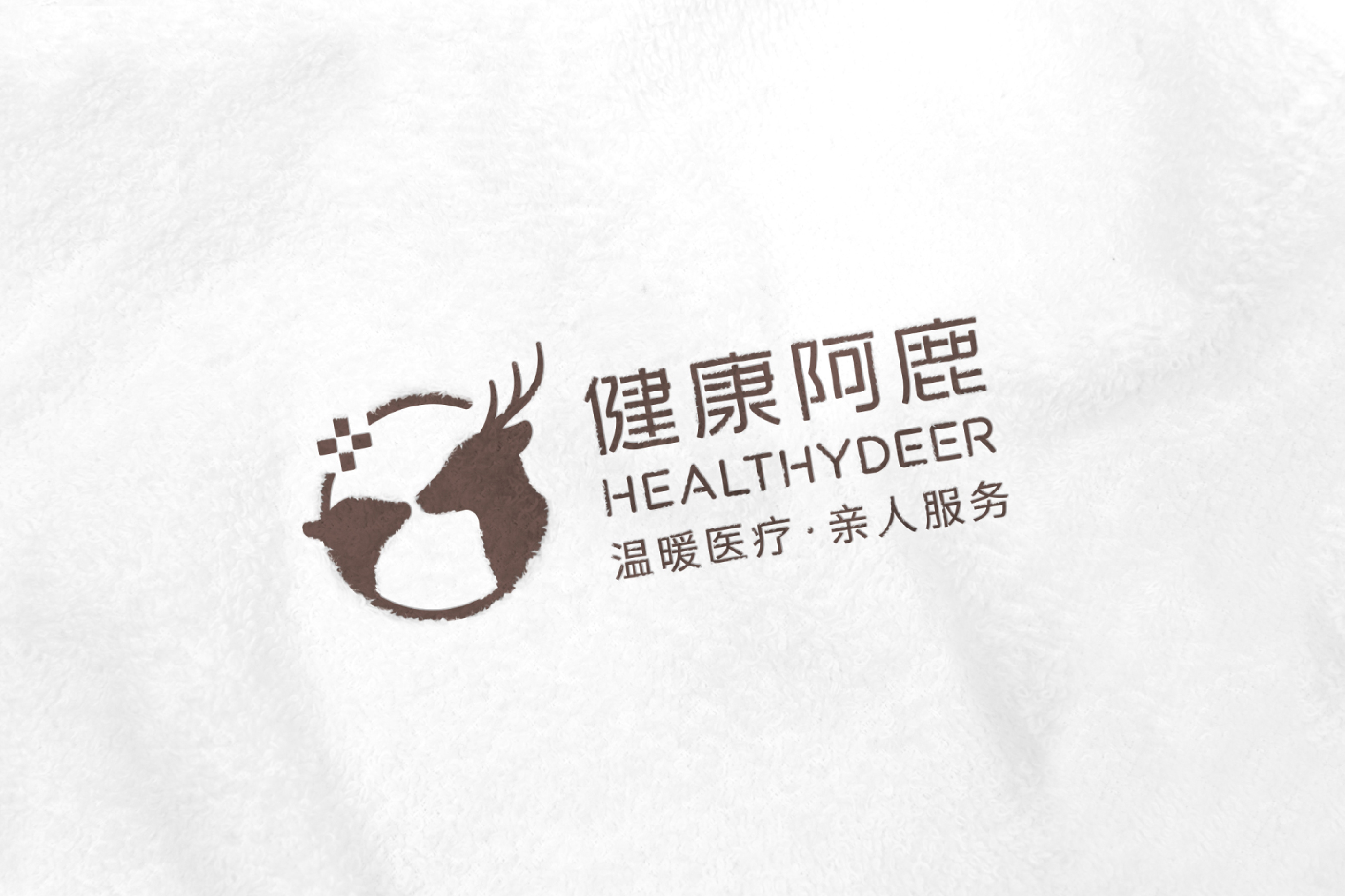
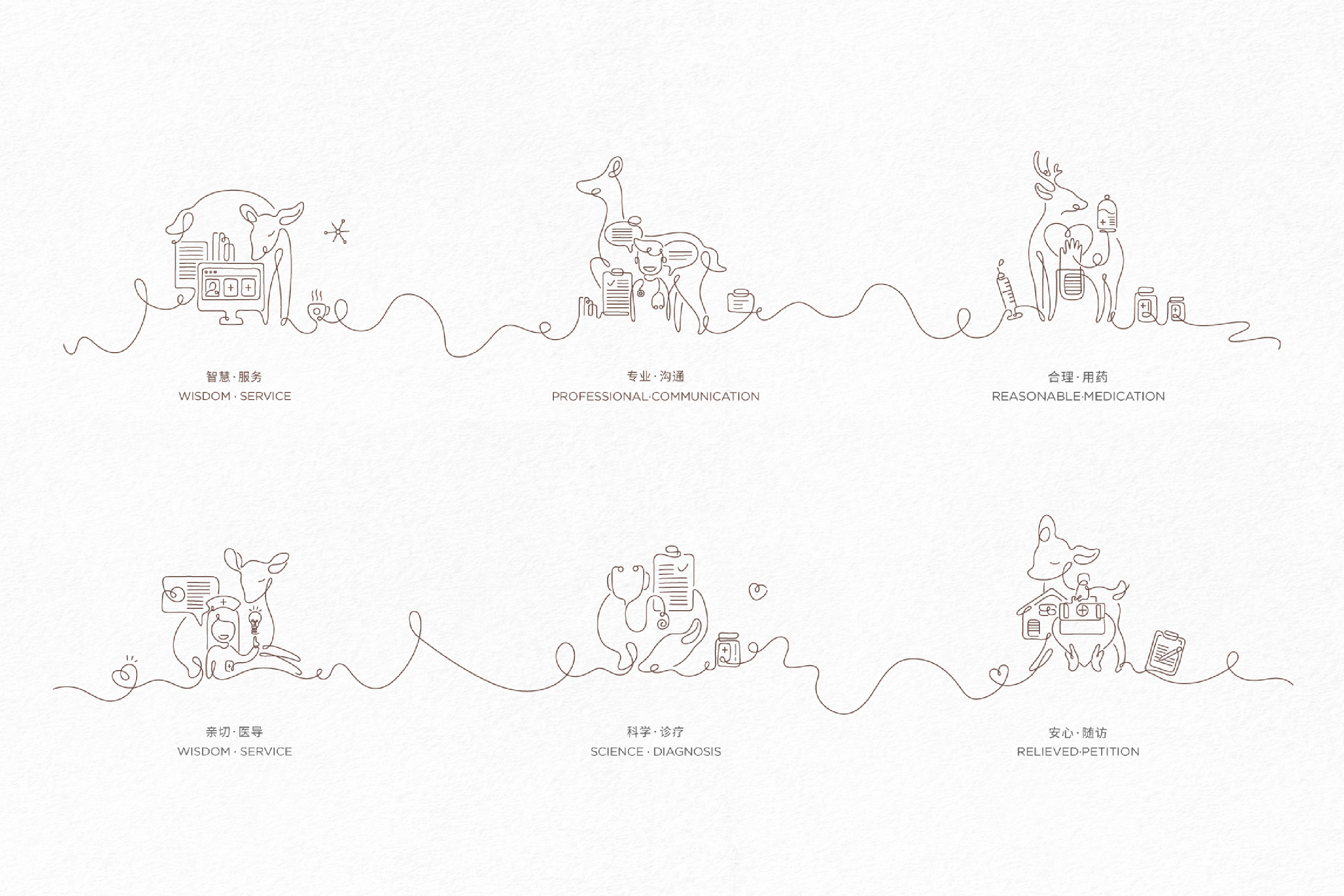
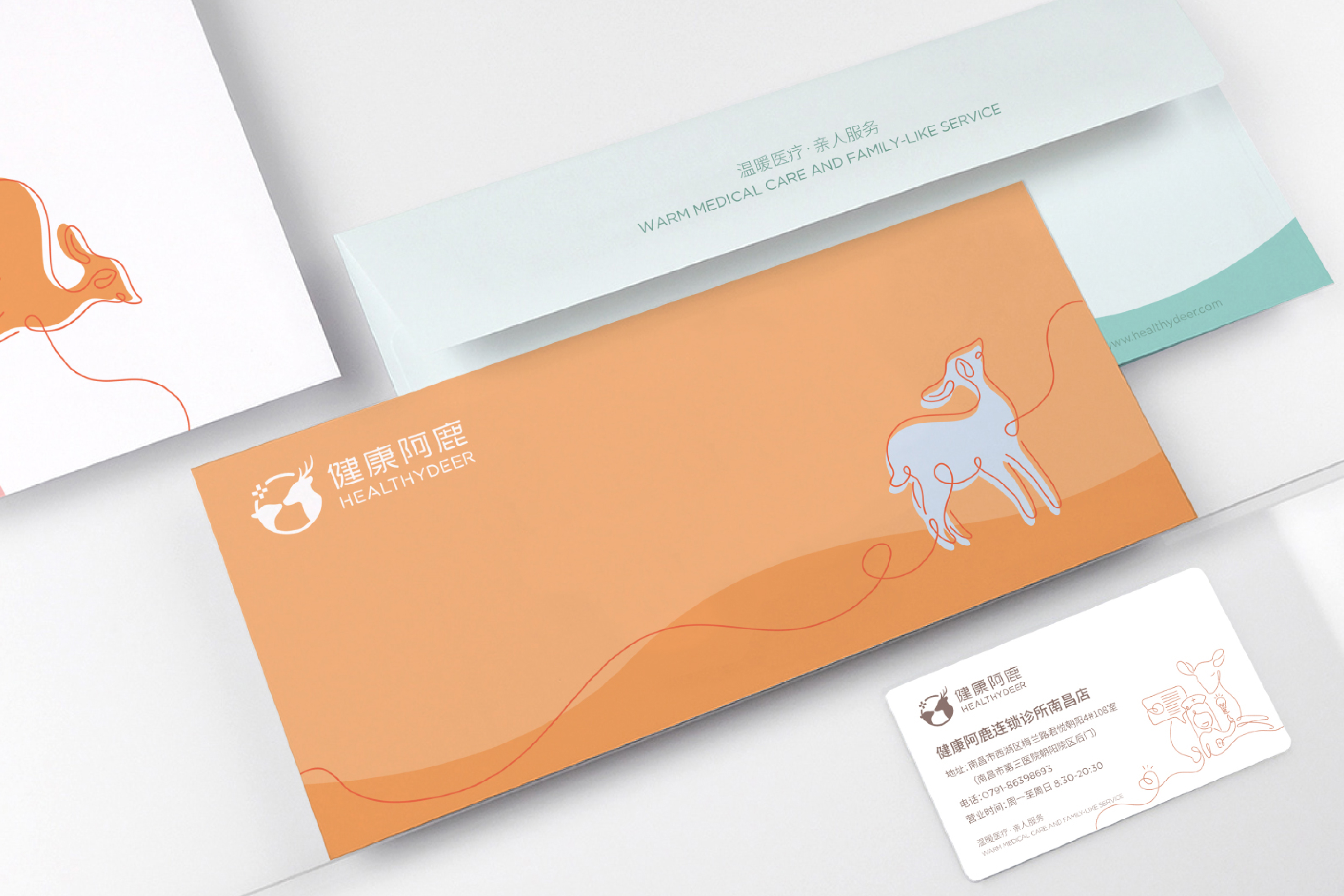
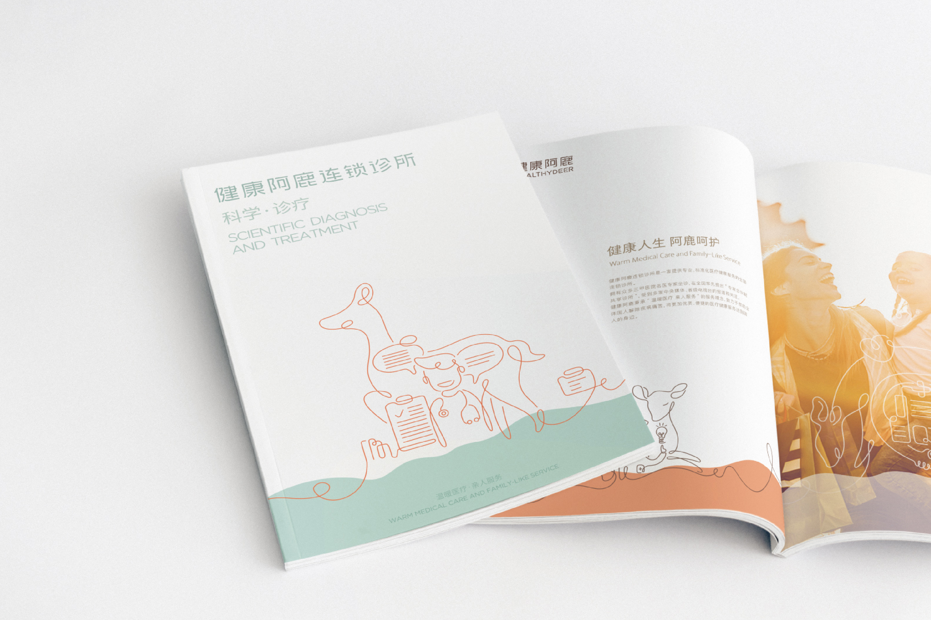
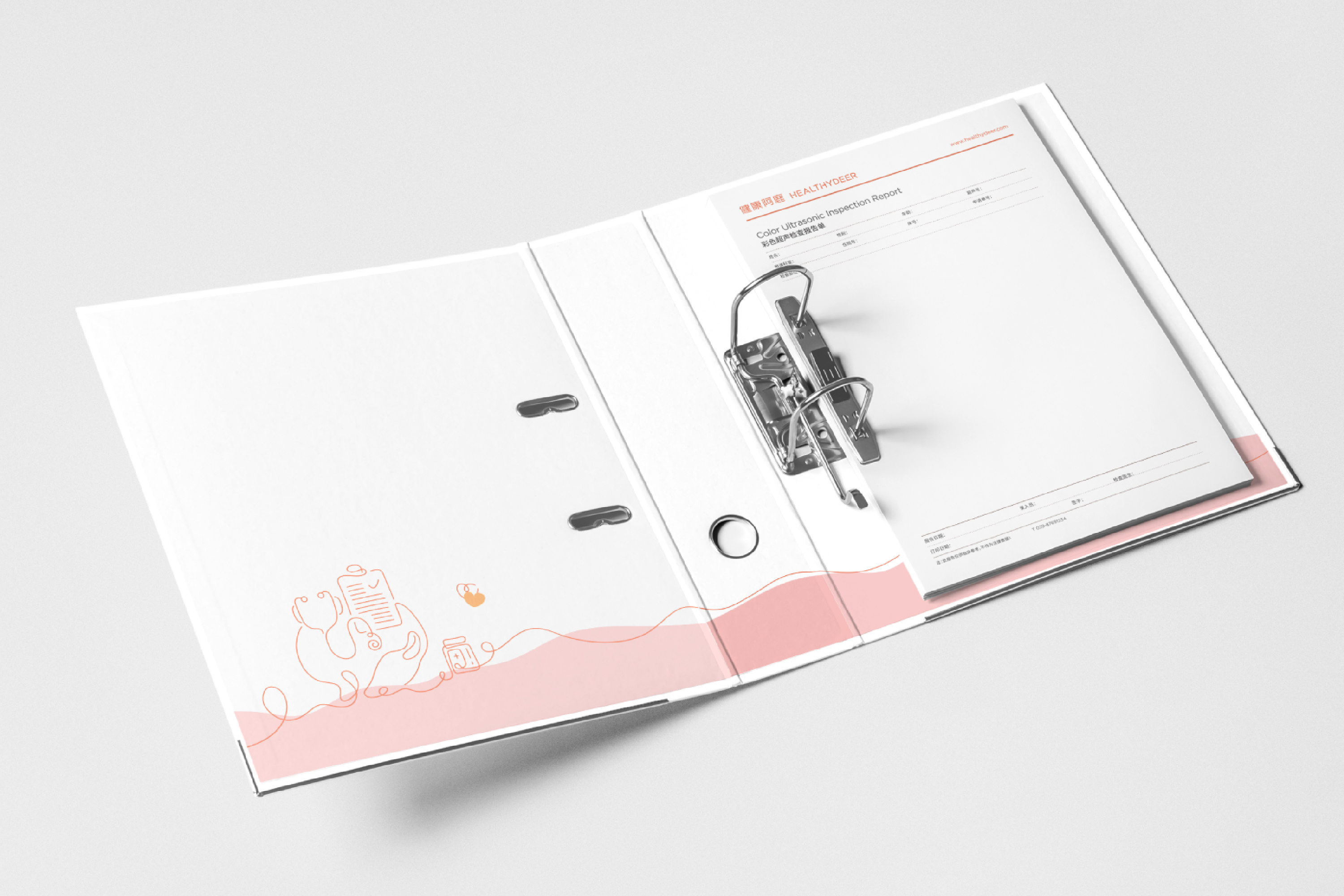
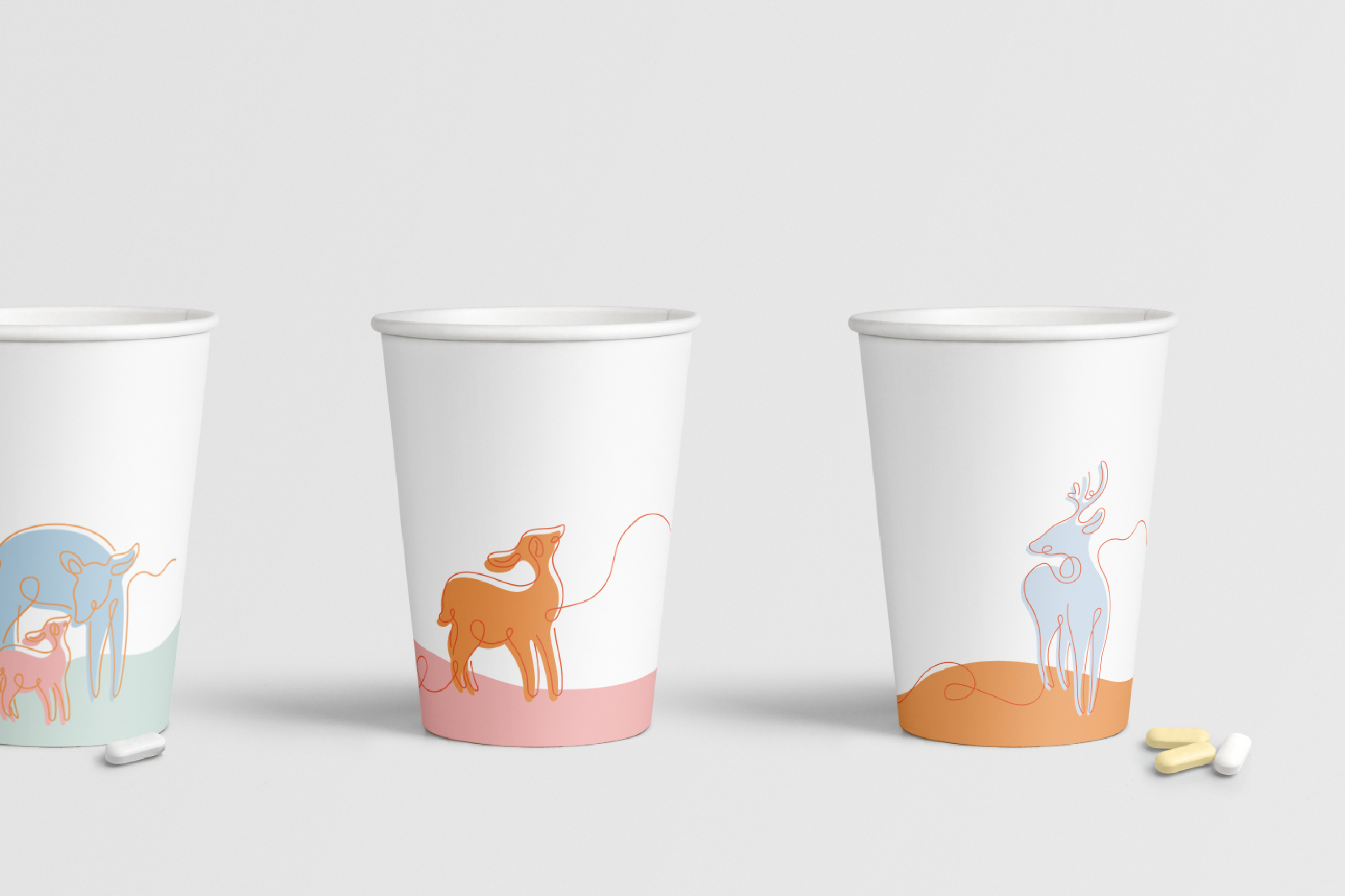
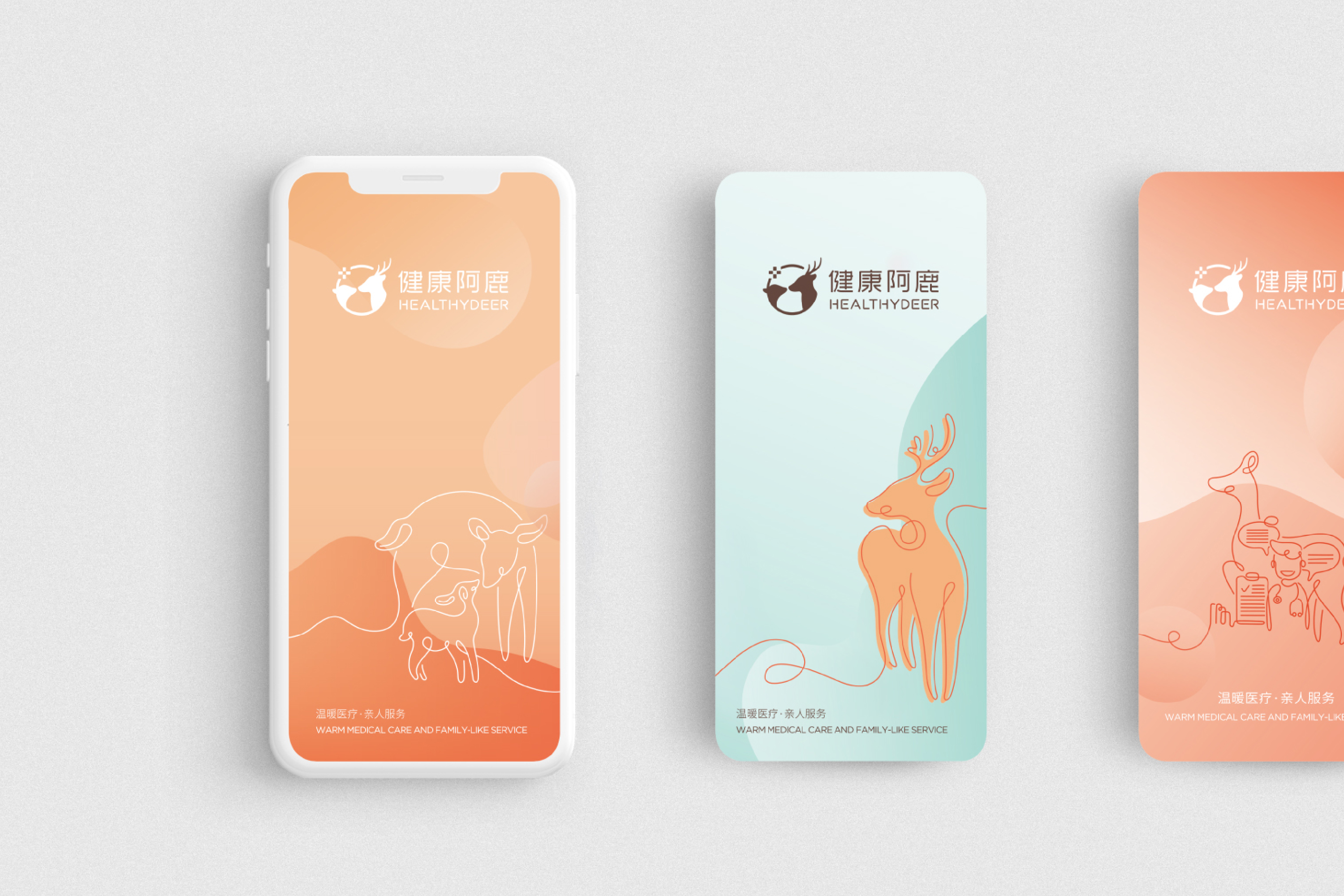
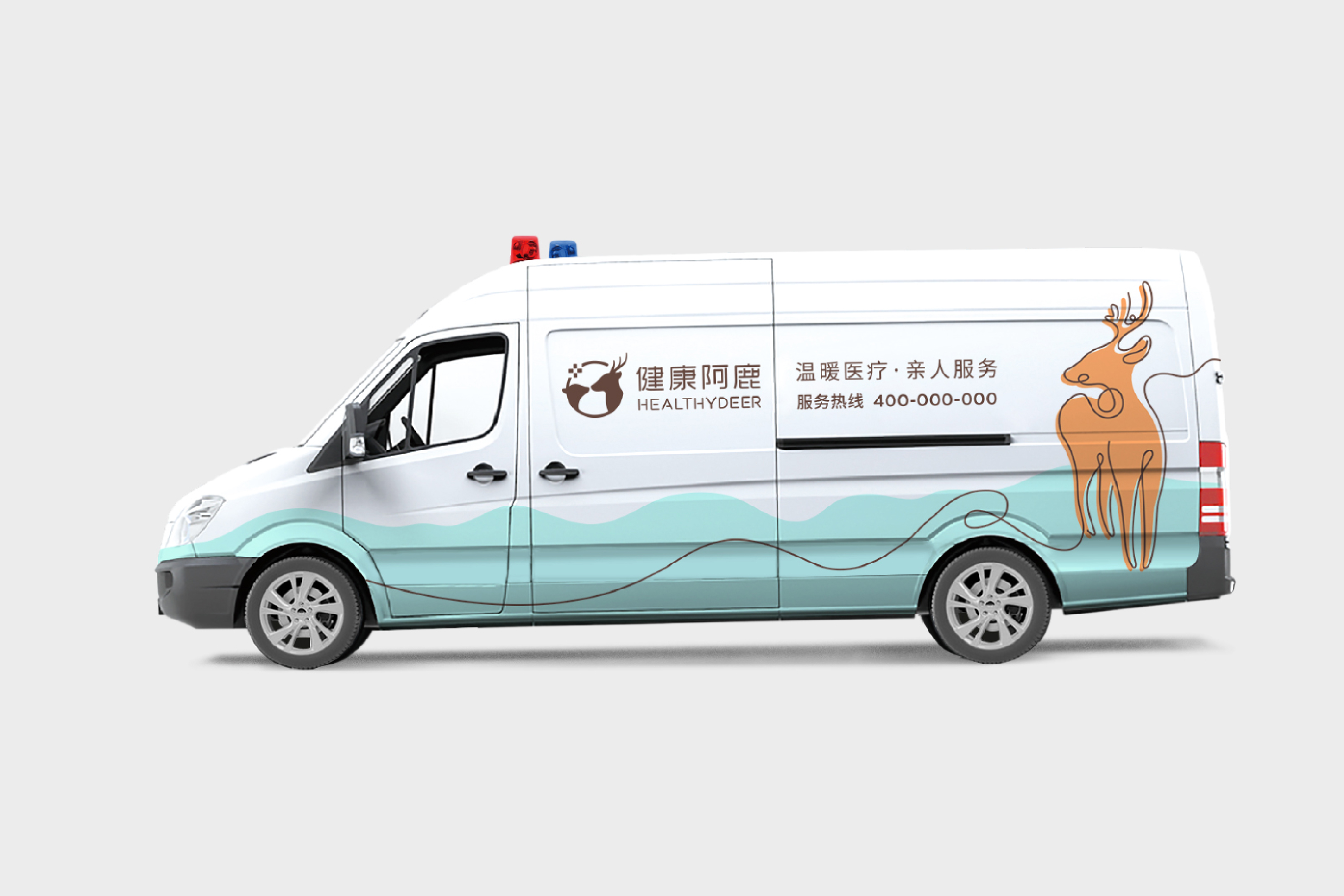
"Healthy deer" is a modern chain type community clinic. Besides offline stores, it also provides online health management service software for patients, creating Internet plus medical service features, connecting patients and clinics with Internet to achieve better quality and more efficient health care services. In terms of logo design, we adopt a simple graphic combination scheme, with two deer, one big and one small, as the main body of the brand logo, forming a connected visual effect between deer and deer, closely focusing on warmth and care, and transforming the visual impression of "warm medical treatment and family service" with the concept of interconnection. The design method adopts a one stroke and coherent line design to draw the patterns of different scenes, highlight the sense of connection and maintenance between patients and clinics, and echo the attribute of convenient communication on the Internet. In terms of brand color, light pink, light blue, light green and light orange are used to create a fresh, friendly and warm brand feeling, and express the modern health management service of "healthy Alu" through comfortable visual feeling.
-
「健康阿鹿」作为现代连锁型社区诊所,除开设线下门店外,亦为患者配备线上健康管理服务软件,打造「互联网+医疗」的服务特色,用互联网连通患者与诊所,以达到更优质、更高效率的健康医疗服务。标识设计上我们采用了简约的图形组合方案,以一大一小的两只鹿为品牌标识主体,在鹿与鹿之间形成相连的视觉效果,紧扣温暖、呵护,以相互连结的概念来进行其「温暖医疗,亲人服务」的视觉印象转化。设计手法上采用了一笔画成、连贯性的线条设计,绘制出不同场景的图案,凸显患者与诊所的连接感及维系感,同时呼应互联网便捷沟通的属性。品牌色上,采用淡粉、淡蓝、淡绿及淡橙,以打造一种清新、亲和、温暖的品牌感,通过舒适的视觉感受表达「健康阿鹿」现代化的健康管理服务。
Art Director: Song Boyuan
Designer: Lu Huiyun / Tiga
Year: 2019
Client: Shenzhen Health Deer information Technology co.,ltd
深圳市健康阿鹿信息科技有限公司
