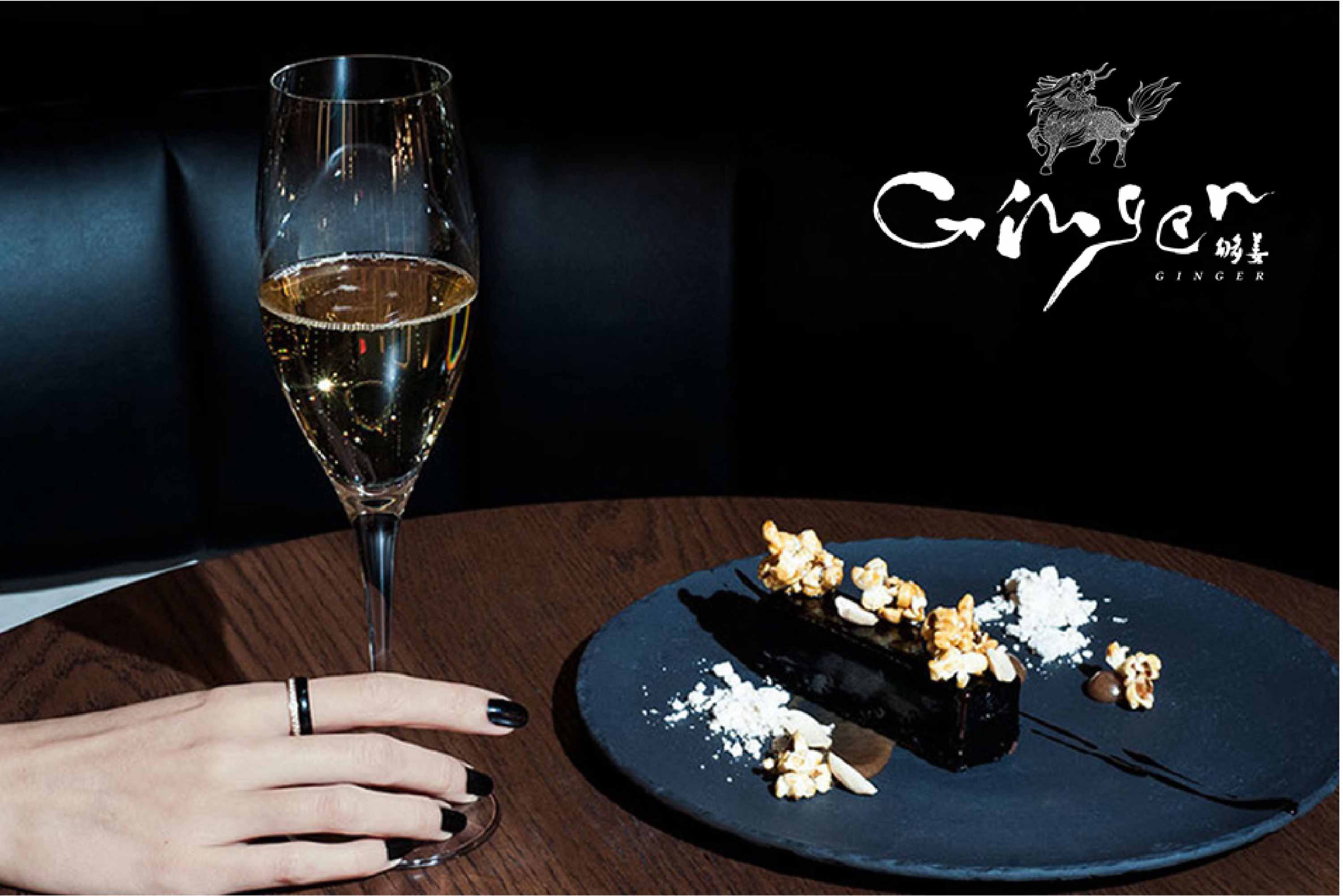
够姜 GINGER Restaurant
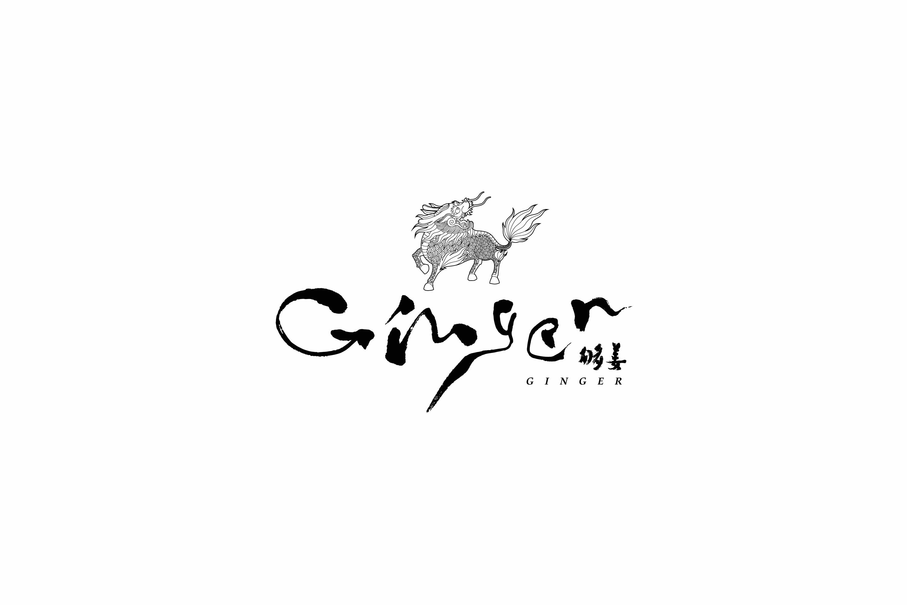
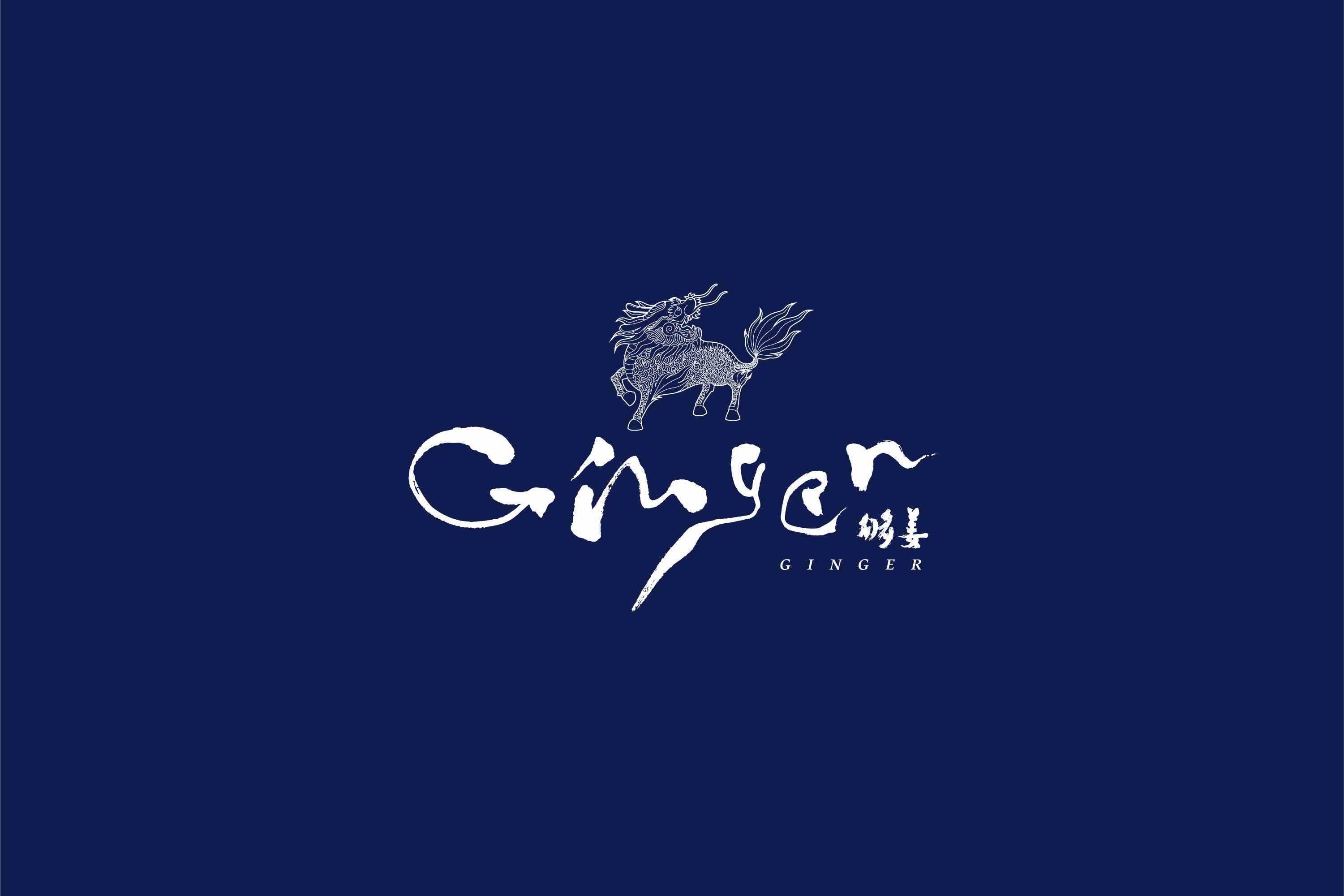
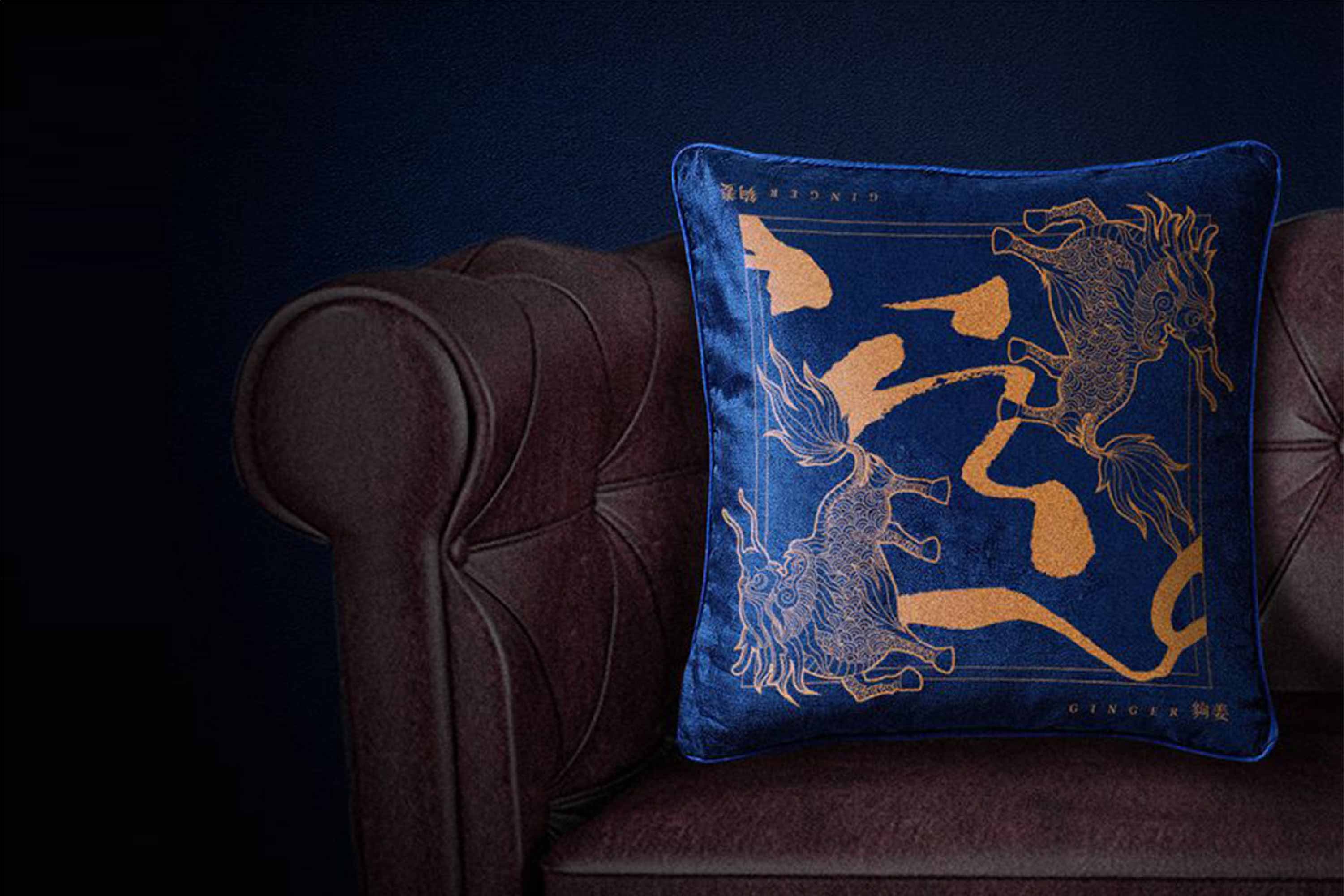
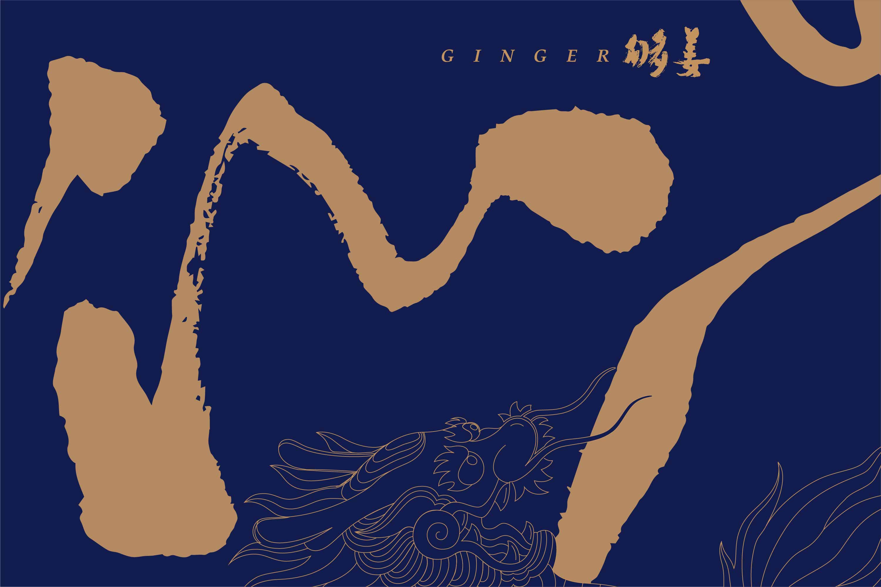
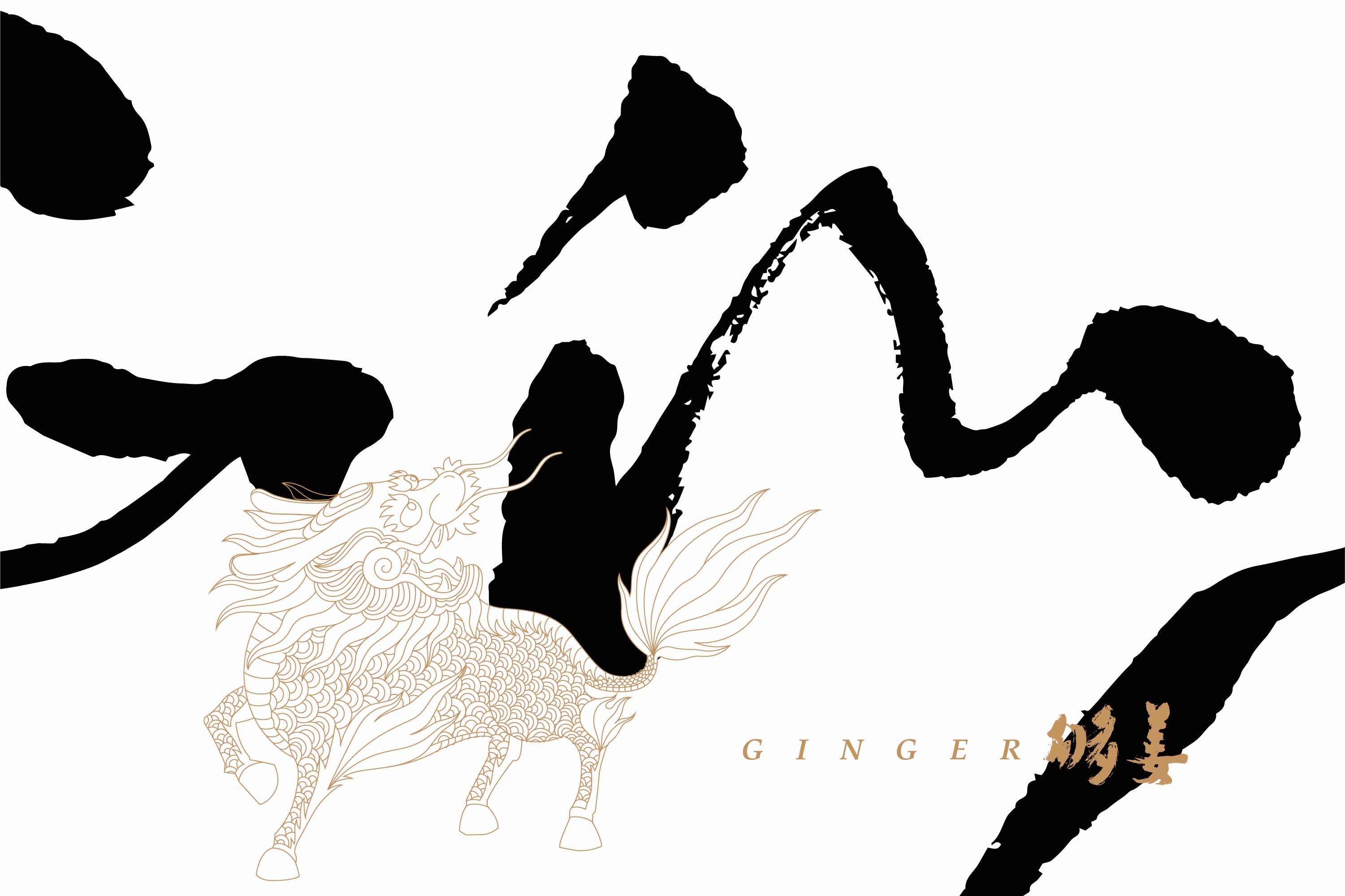
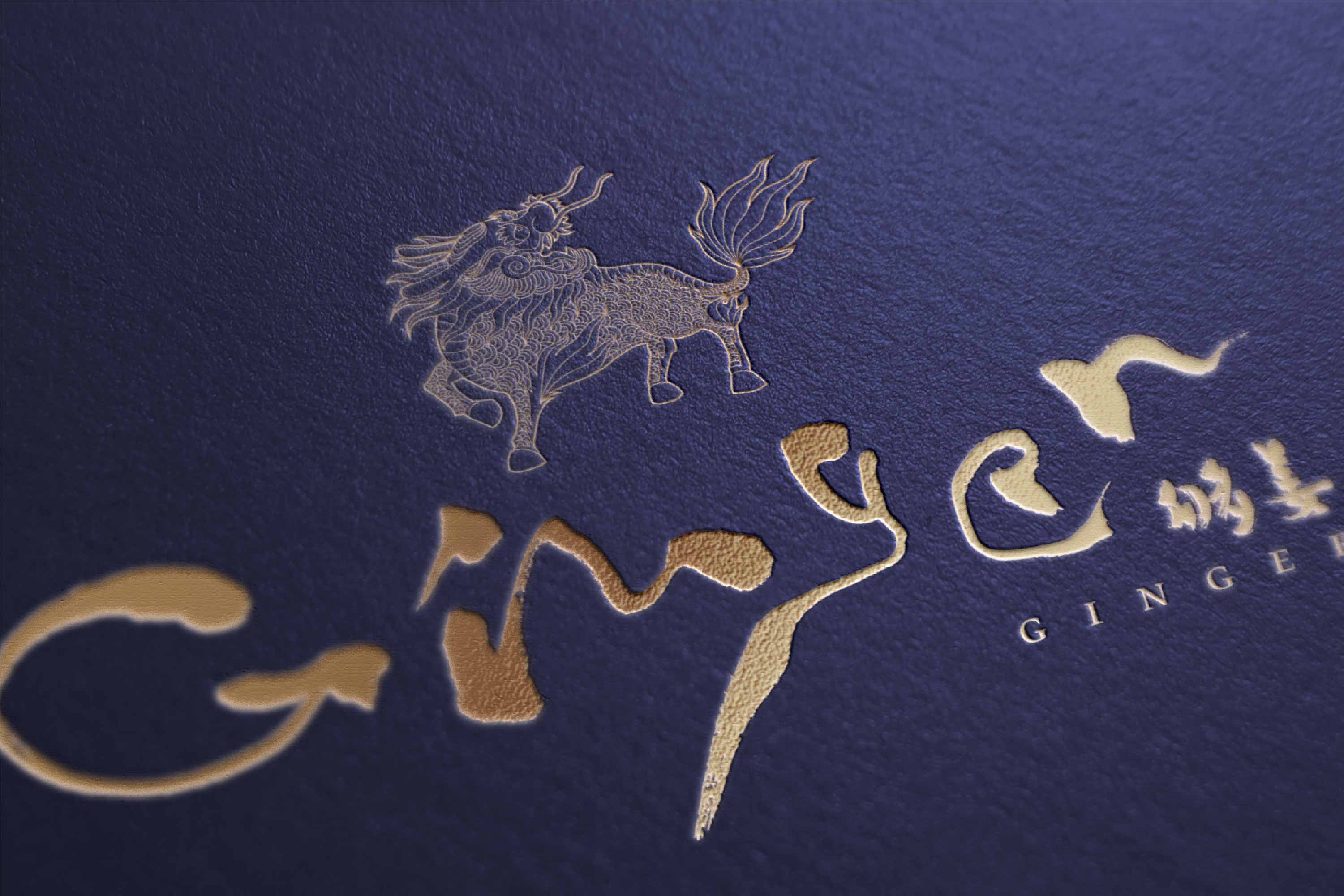
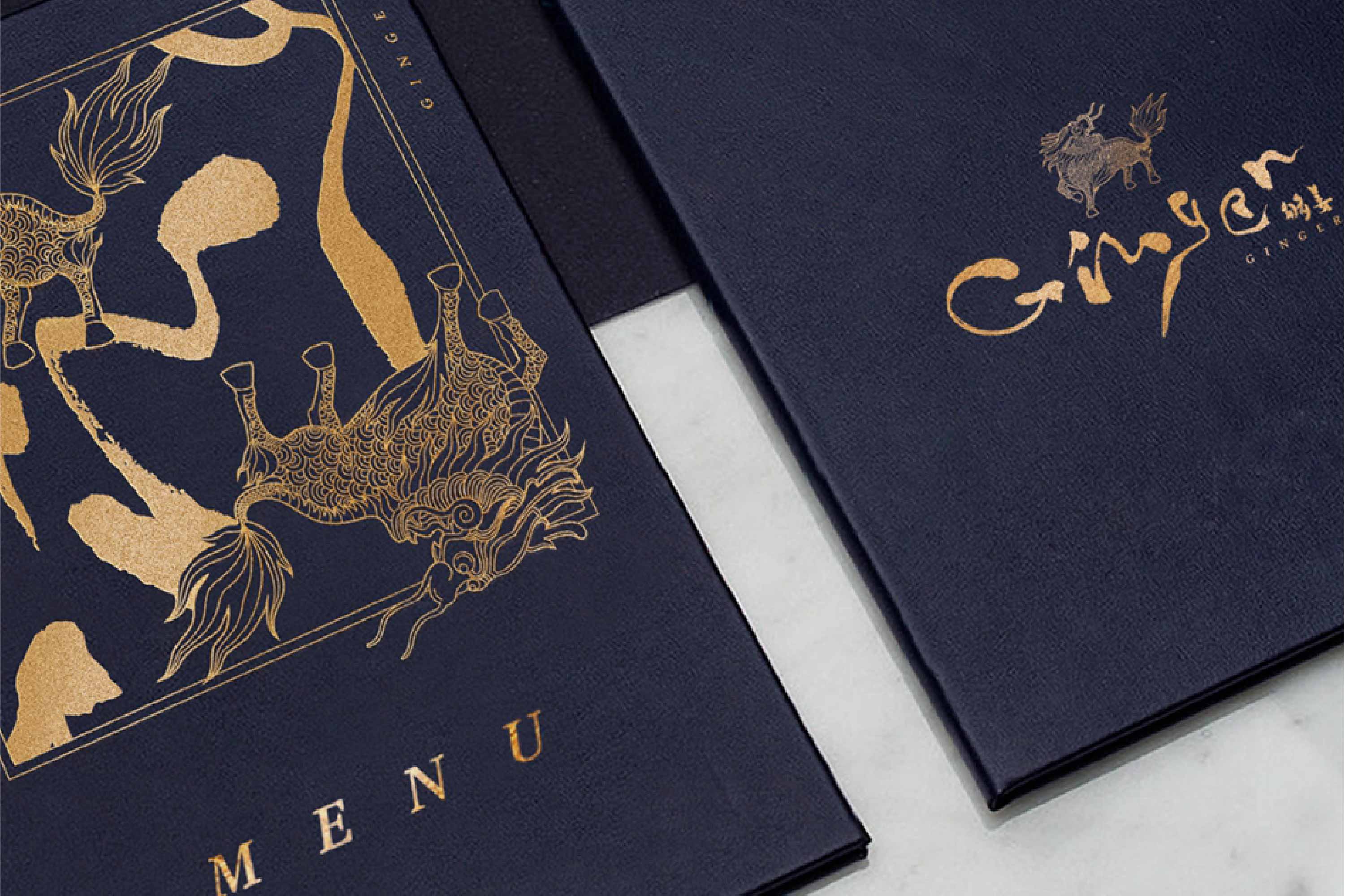
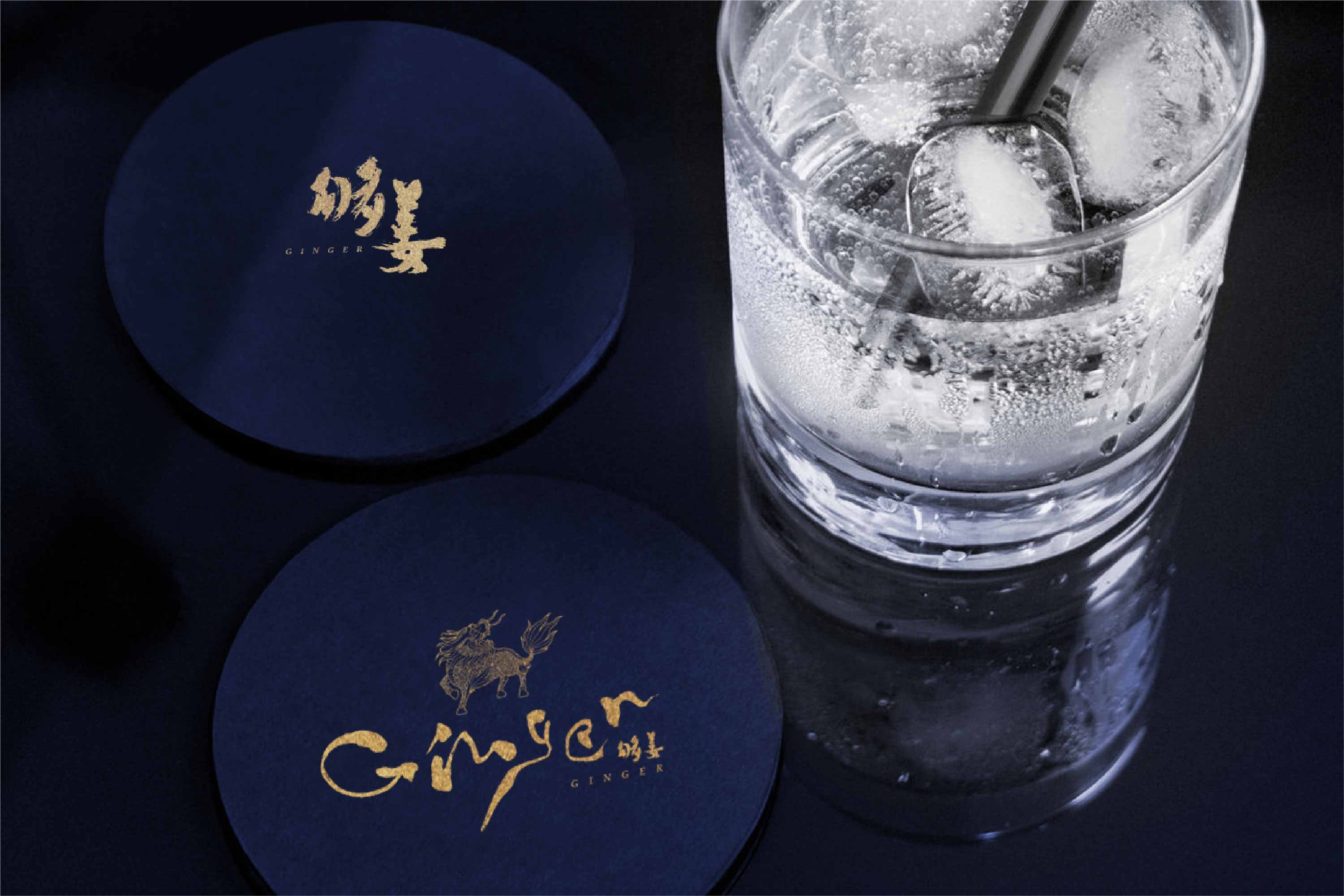
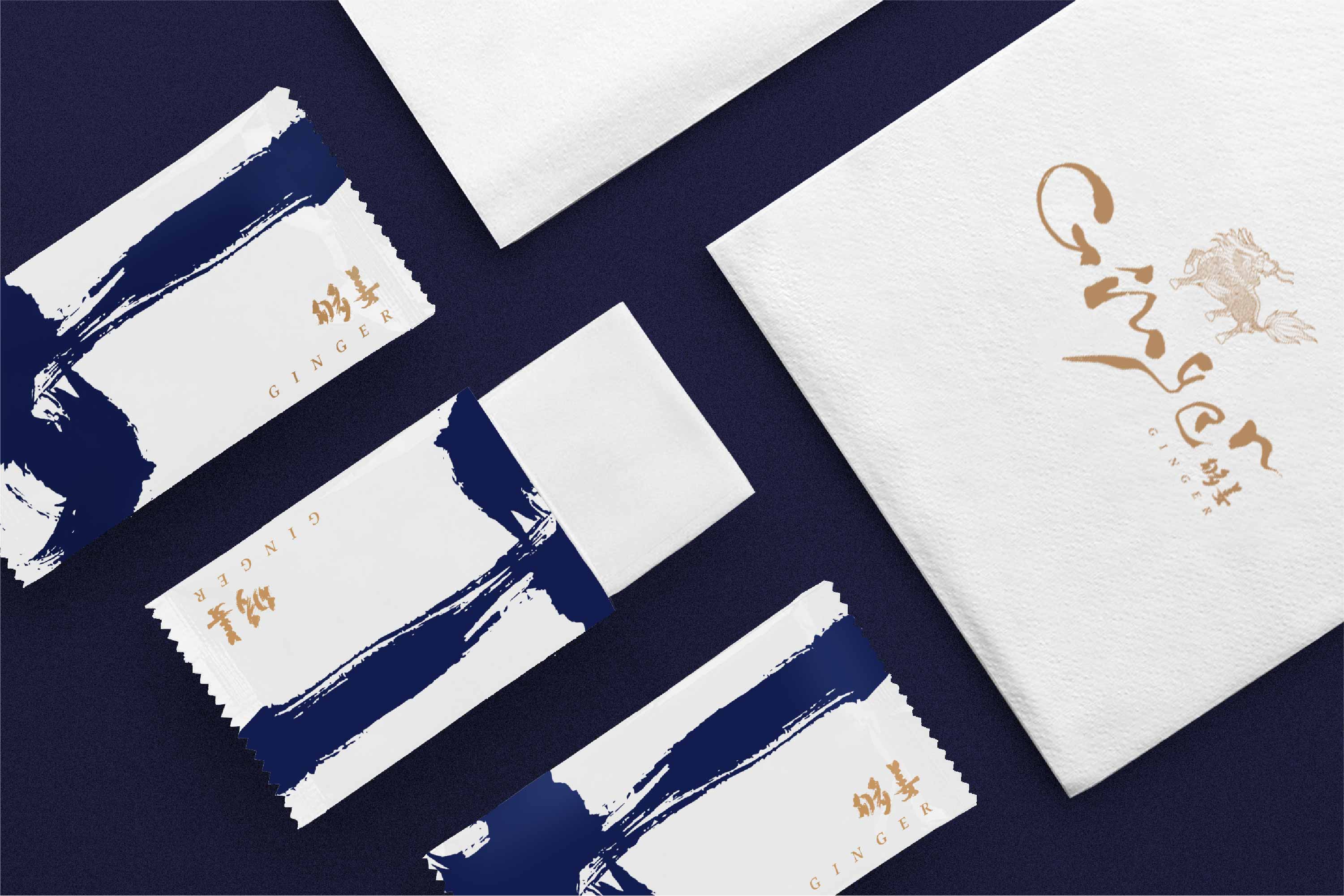
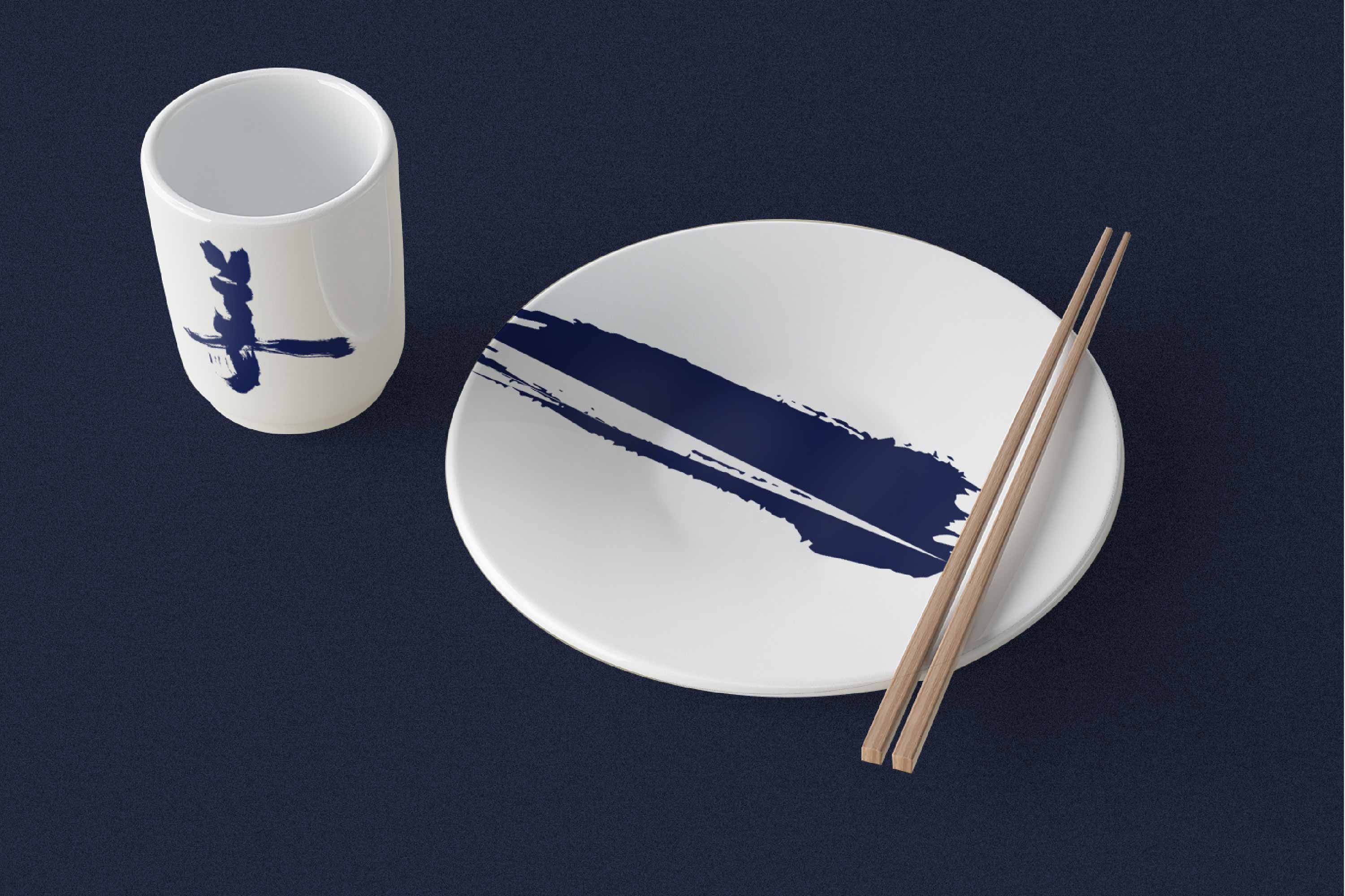
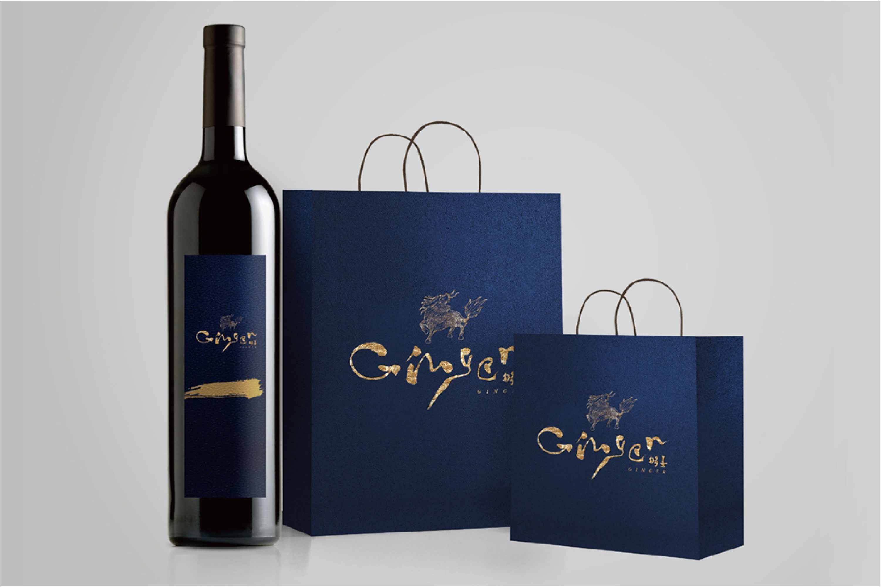
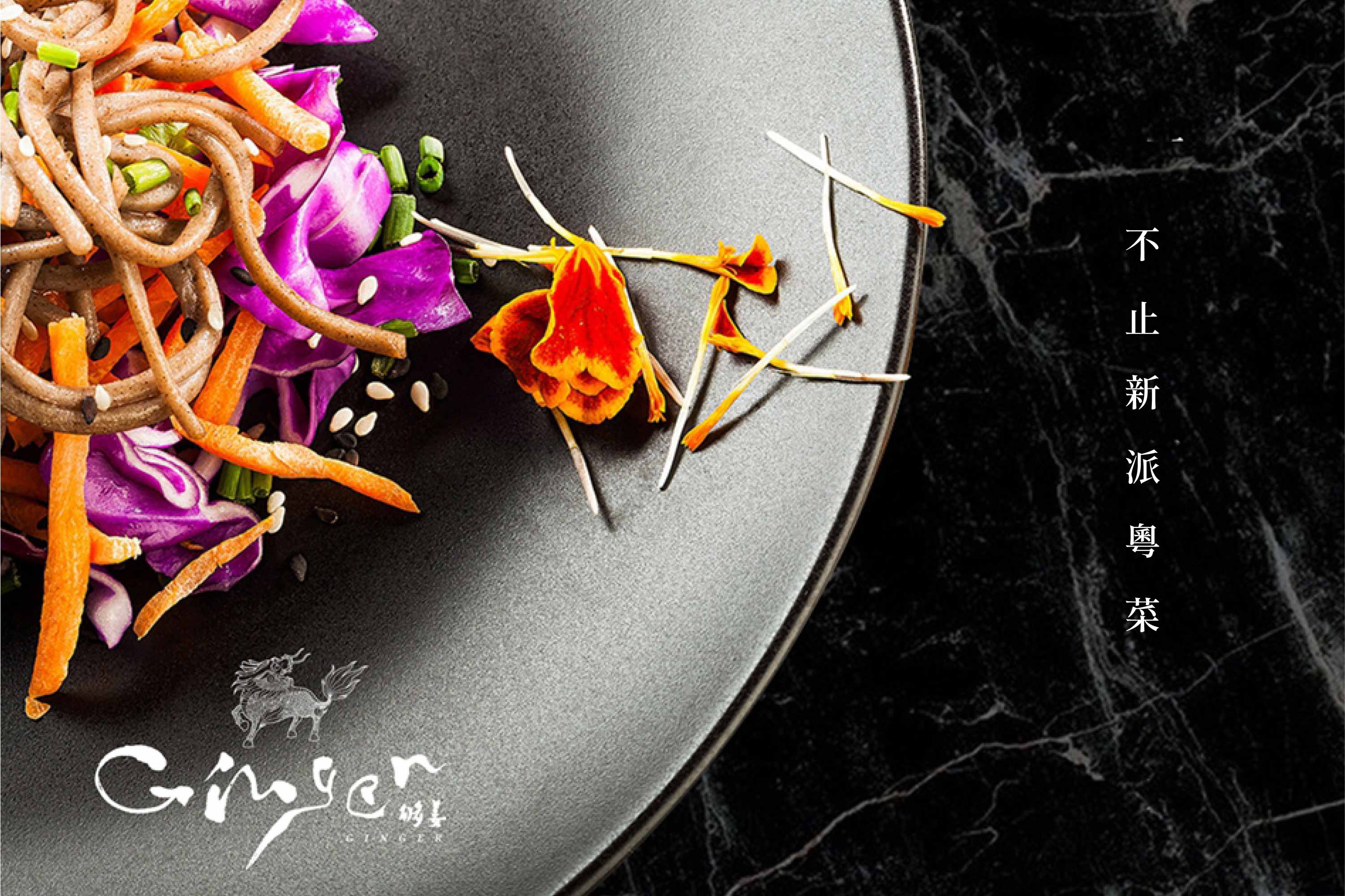
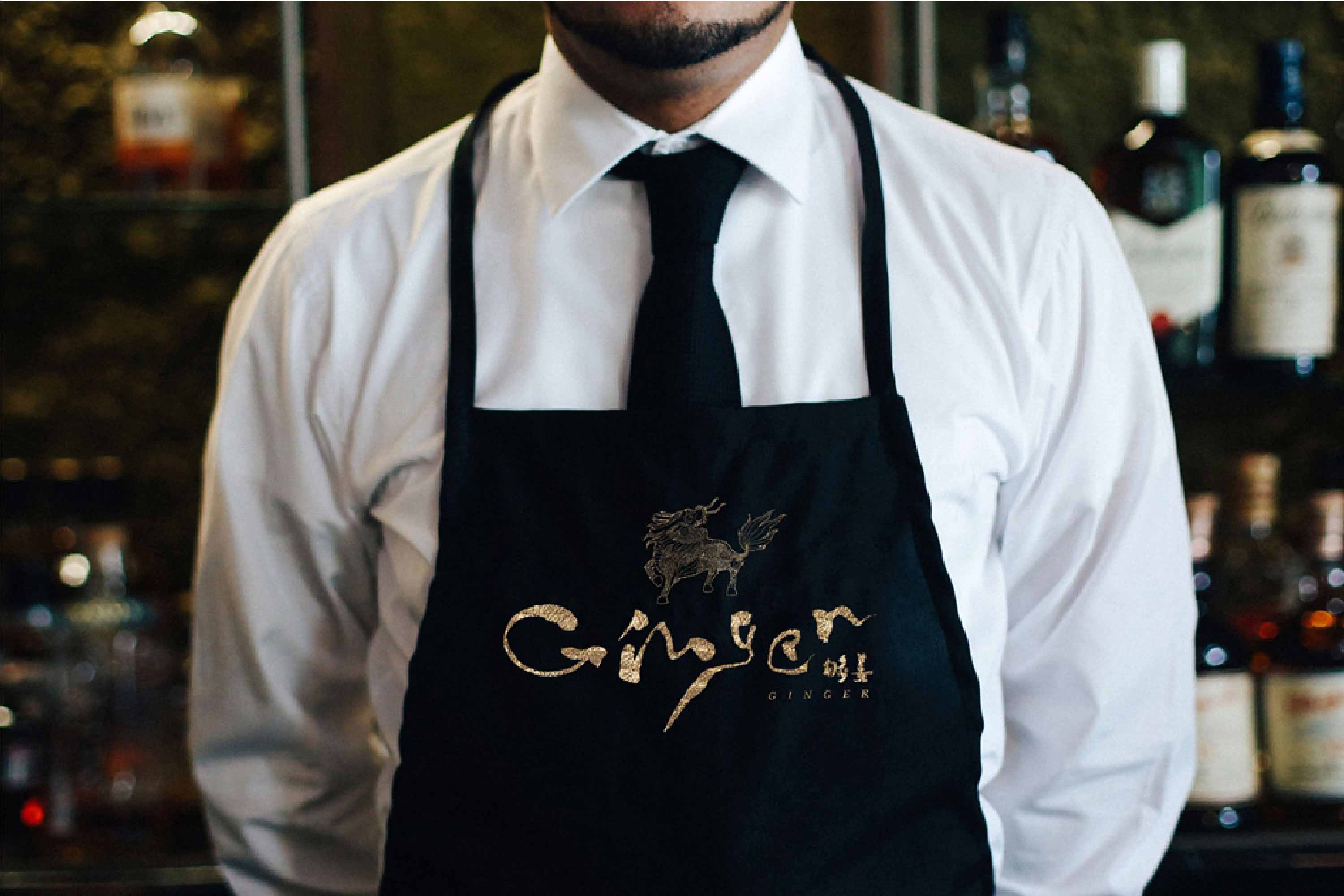
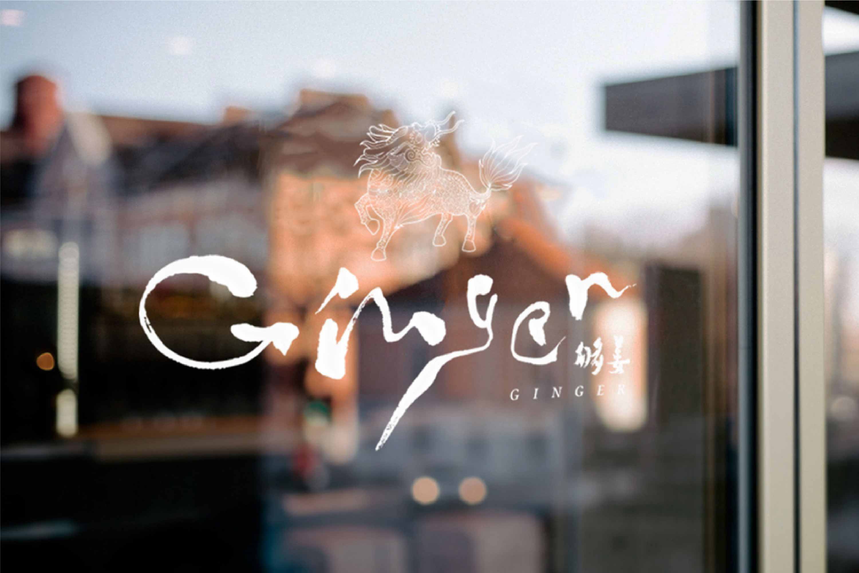
"Ginger" is a Cantonese saying. It's kind to describe someone as hot and domineering as ginger. With this courage, temperament and expectation, a group of energetic post-80s and 90s established "Ginger". New style Cantonese food bar, clearly point out the brand attribute; The brand positioning of "more than new Cantonese cuisine" has aroused consumers' curiosity. But how to inject vitality into "Ginger" and make it live in food and outside the restaurant has become our thinking after receiving this project. We first created a virtual personality for "Ginger": one that can stand up and put down; The stable, casual, restrained and free yuppie man grabs the visual image from the brand personality. Finally, we chose "Kirin" as the core symbol of "Ginger". Kirin is embroidered on a military officer's official uniform. The military officer pays attention to one skill, that is, kung fu. "Ginger" is the quality of time, dishes, service and atmosphere. Kirin's image reflects "Jimei" and "benevolence and demeanor", which complement the brand characteristics of "enough ginger". Ginger, enough ginger. Calligraphy is elegant, steady and restrained. The English name of the brand is recreated with traditional Chinese calligraphy. The unique strokes reflect ruffian, casual and free. The whole presents a style and expression that integrates China and the west, establishes the brand tone and echoes the brand character again. With black and white, yuppie blue and ginger as the main colors, it is calm, atmospheric, exquisite and fashionable.
-
「够姜」是一句广东俗语。形容某人像姜一样,够辣够霸气很有种。一群充满活力的8090后,带着这种胆识、气质和期许,成立了「够姜」。新派粤菜餐吧,明确点出品牌属性;「不止新派粤菜」的品牌定位,引起消费者好奇心。但如何为“够姜”注入生命力,使它活在食物里,餐厅外,成为我们接到这个项目的思考。我们先为「够姜」虚拟了一个人格:一个端得起、放得下;稳重又随性、约束又自由的雅痞男,再而从品牌人格中抓取视觉意象。 最终,我们选取了「麒麟」作为「够姜」的品牌核心符号。麒麟被绣在一品武官的官服上,武官讲究一技在身,即功夫。在「够姜」,便是工夫,菜品、服务、氛围的品质。麒麟的形象体现了「集美」和「仁厚和风度」,与「够姜」的品牌特性相辅相成。Ginger,够姜。书法,即雅、稳重、约束。以中国传统书法再造品牌英文名称,洋洋洒洒、独一无二的笔触,体现了痞、随性、自由。整体呈现一种融合中西的风格和表达,奠定品牌调性并再次呼应品牌性格。以黑白、雅痞蓝和姜黄色为主色调,沉稳、大气、精致、时尚。
Art Director: Song Boyuan
Designer: Xuhuifeng
Year: 2017
Client: Ginger Restaurant.